With the launch of Hawkes Brewing on Anzac Day. We talk to chulo creative illustrator Kevin O'Donnel and David Gibson the founder about what it all means to them.
Chatting with David Gibson
How did you choose the illustration style for the logo?
We wanted a style that was fit for an ex-prime minster. Something timeless that lived up to Bob's Iconic status and our chosen style was the perfect mix of that.
With so many Australian icons, how did you manage to chose Bob? and not Warny or Merv?
Bob was chosen because is by far the greatest leader Australia has ever seen and is a true man of the people. He transcends politics and generations and holds the right values that our company lives by. He was the perfect person to represent our core value of giving back after being responsible for helping make Landcare a national movement in the 1980s. There would be no one better to represent the face of our brand.
Whats next for Hawkes brewing?
Hawke's Brewing will continue to focus on creating great tasting beer as we will be looking to introduce new product variants and at the same time focus on our amazing partnership with Landcare Australia.
Chatting with Kevin O'Donnell
How does it feel to be asked to draw one of Australia's most iconic legends/politicians of our time?
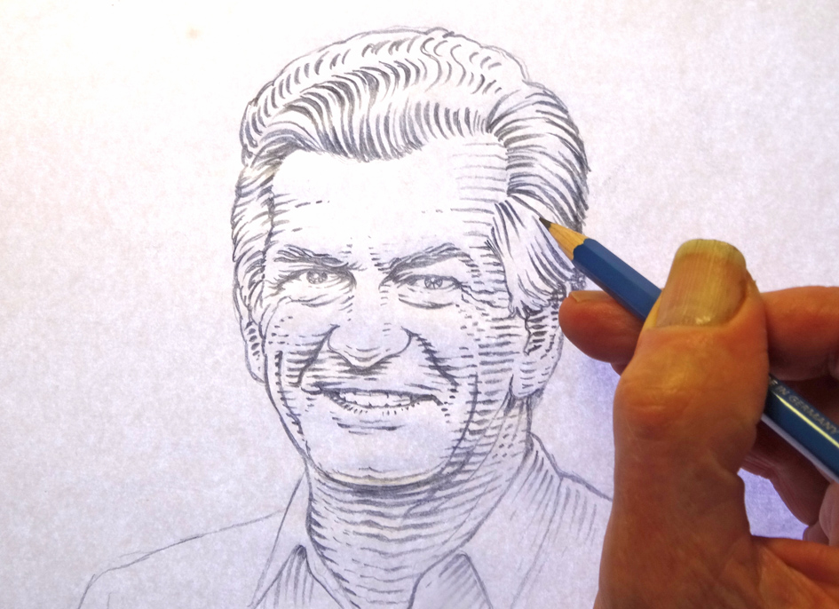
I regard doing an illustration of Bob Hawke as a privilege. He is such an icon of Australian politics. I remember when he was head of the ACTU in the 70s, solving intractable union strikes. He had a brilliant raised eyebrow and gravel delivery when asked a question. It’s this character that I’ve tried to capture.
The artwork looks somewhat hand crafted, are you able to tell me a little about your process and why you did it in that style?
I’ve used hand drawn line work with a woodcut, etching feel to it similar to that of some bank notes as once it’s vectorised it can be reproduced at any size and retains it’s detail and shading. It’s an old fashioned technique but works well on portraits of renowned people.


