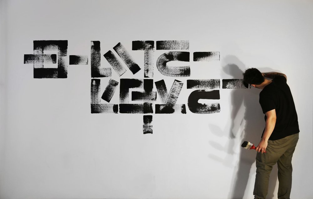
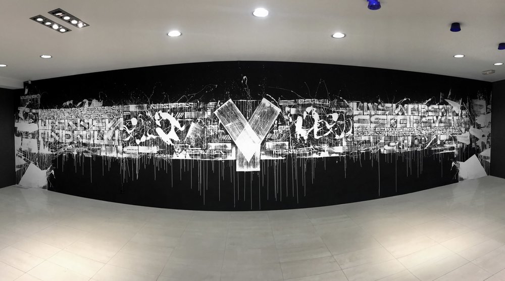
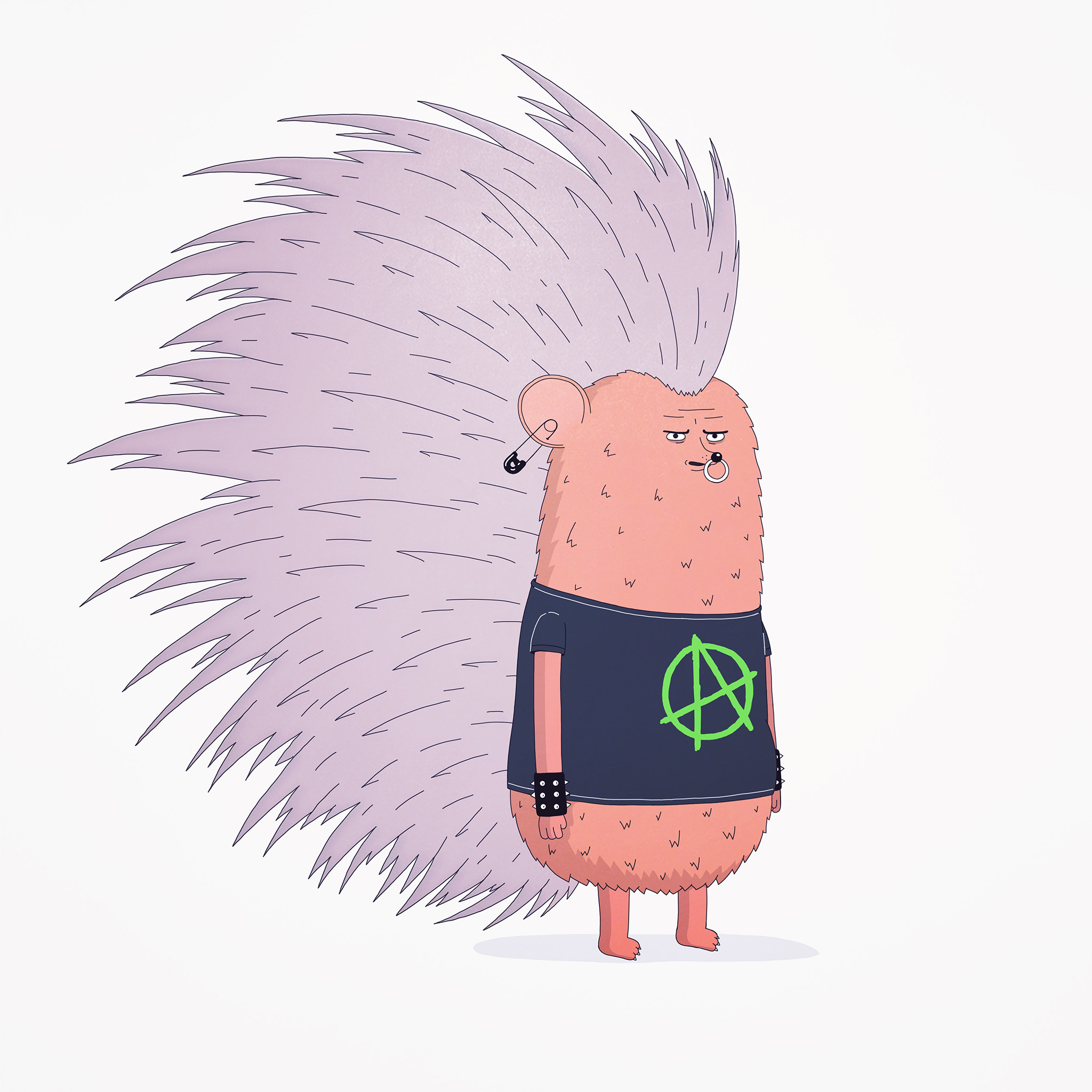
The Krank’s most iconic element is his unique alphabet which has established him in the current street-art scene gaining more publicity every day. He has a distinct and strong Berliner aesthetic portraying deep messages which take over space by creating a unique and ultra-dynamic art exhibition both indoors and outdoors.
CAPICHE
CAPICHE
Welcoming Sydney based pasteup mural artist Katie Cesaro AKA Capiche - a who is best known for her large-scale monochromatic portraits.
Capiche uses a range of mediums from photography, stencilling, and image transfer techniques to execute her work. Her dramatic oversized portraits are often a fusion of her documentary photography and digital paintings. Capiche has been featured for numerous commissioned projects throughout Australia and is currently exhibiting work in the Northern Rivers.
‘The Last Bloom’ for Sea Walls Mexico by Gina Kiel
Gina Kiel talks us through her epic mural ‘The Last Bloom’ for Sea Walls Mexico.
Cozumel has become primarily a tourist area with hundreds of people coming onto the Island from cruise ships daily, to go diving or snorkelling, to see the coral, which as I experienced first hand is fast becoming an underwater desert.
.
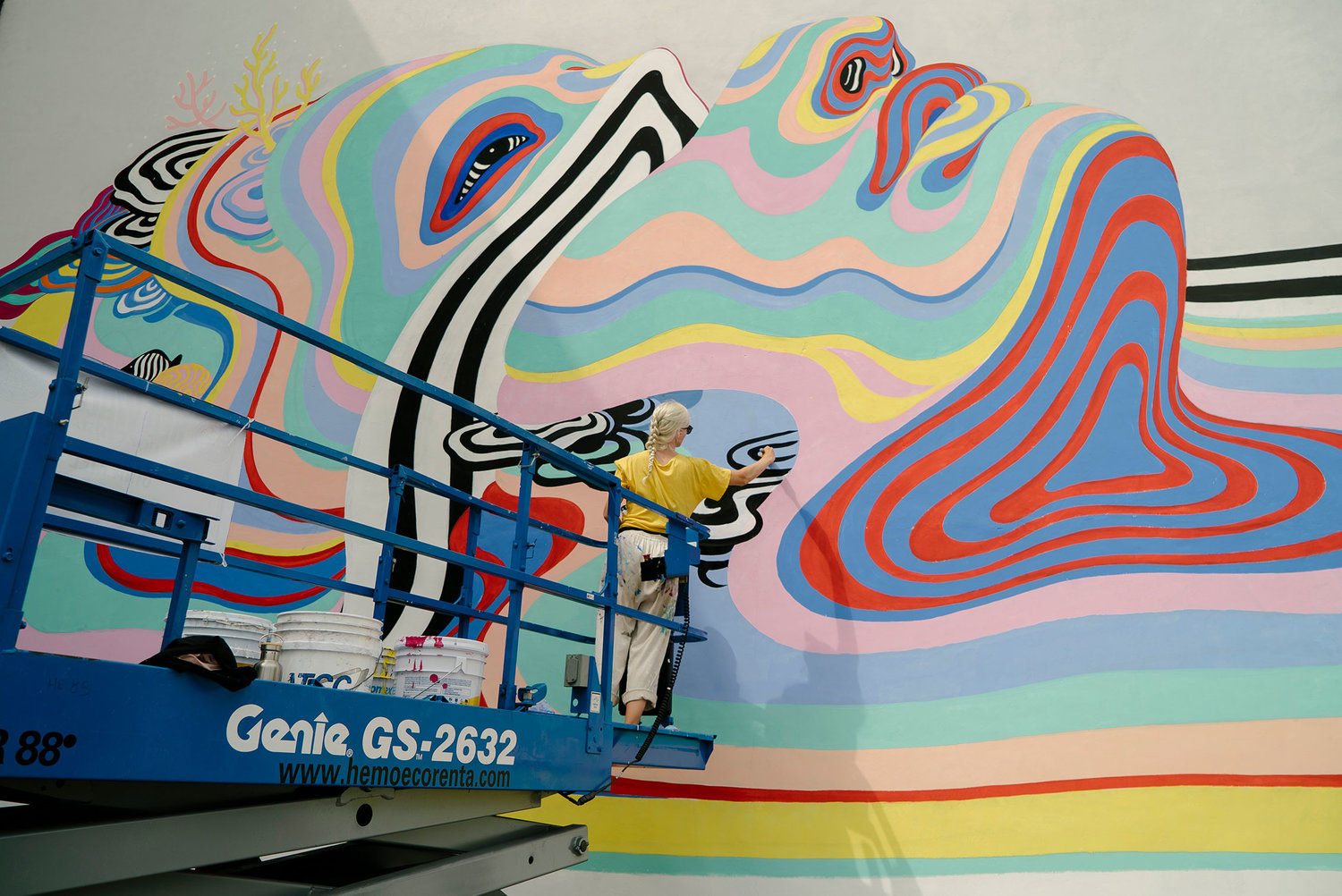
Coral is commonly mistaken for rocks or plants and many of us are unaware that these delicate creatures, growing like little mothers providing a nursery for thousands of species of fish, are actually living creatures. In my mural I have personified coral in the form of the face of Mother Nature, a relatable image for us humans, illustrating that coral is a living entity and to tread carefully in the water. Just like us, once it is gone, it is gone. A reminder to be careful not to stand on or touch her and not to use sunscreen in the ocean as it creates a barrier stopping nutrients from the sunlight reaching through the water to the coral.
.
The black and white splitting and melting of the form in the mural represents the rapidly declining and dying coral reefs. This is due to many human impact/global warming factors including rising water temperatures that cause non-reversible coral bleaching and an increase in smothering sponges & algae, sunscreen, and sediments upturned by ships. The large scale of the coral mother in comparison to the tiny diver represents the large scale of the issue we are facing and the beauty we are loosing before our eyes.
Shannon Crees Creates Amazing Mural Overlooking Bondi Beach
Overlooking the east coast headland just off Sydney’s Bondi Beach. Shannon Crees creates a beauty of a mural on a dusty old shed at Bondi’s golf course for Jaguar Land Rover to launch the new Range Rover Evoque in Australia.
Simple things used to make our hearts warmer - Cassio Bittencourt
We caught up with Cassio Bittencourt to chat about what floats his boat. Check out the interview below.
Q - What got you into the illustration game? Can you name any childhood memories of drawing?
Well it all started with comics. I was always crazy about Marvel stuff and fortunately I grew up in a neighborhood where a good friend of mine also loved it. Back in the day, we actually had our own comics where I used to work on the illustrations and my friend would put some colors on it. The crazy thing is that he kept this 22 year old drawings and a few months ago he went to visit me and my wife and he brought them all. All those 1997 hand made comics with just paper and pencils. I felt like a child all over again, just by grabbing those old pieces of paper. It was so nice nice to see that without computers we made so much with so little. Over time we keep our game so professionally, with a tight schedule, crazy deadlines and some boring clients here and there. And we forget how these simple things used to make our hearts warmer and clean up our minds. I have no doubt that keeping this feeling is the greatest challenge in our careers.
Q - What has been one of your most enjoyable illustration jobs and why? Please send us some pics of this work.
There was one illustration I did last year that was, well, not exactly enjoyable. But it was one of the best illustrations I had produced. I think it's worth to mention it anyway because although it was a really difficult client to deal with due to his high quality demands, I learned that sometimes it might be worth it to listen to your client. And that's the point here. We think sometimes that, since we are the specialists, only our opinion matters. And it's not like that. It's like when you go to the doctor and he or she will not care about what you feel or what you have to say. But although you're not the specialist in there, your opinion is very, very important. You want to be heard so the treatment is the best possible, right? It's the same thing with illustration. This client of mine made things very complicated during the process, but together we got the best result possible. It was worth it. And now we are back on another huge project, working to together again.
Q - Perspective and map making are big components in your practice - is there a reason why you have found yourself gravitating towards drawing maps?
That a funny thing, I never felt like I actually chose to work on this kind of style. When I first started professionally one of my biggest clients was a magazine that used to explain things like "why do you have headaches", or "how does a lamp work" using illustrations (obviously). That's how I got into infographics, and how to explain any kind of processes using illustration. A few years later the projects got bigger, so instead of just explaining how a lamp works, I had to explain how do you fabricate paper, showing all the steps on the process - from tree seeding, wood harvesting, paper processing, workers in the factory, transporting, paper uses and international export. The thing is that I had to explain all of this by making every step equally important in the process, equally visible and also easy to understand. It was the kind of problem that isometric perspective would always solve. So before I know most of my work was gravitating around this.
Q - Can you give us a bit of a run down on your process, the programs you use and any interesting quirks in the way you work.
I use mostly Adobe Illustrator for my stuff. One thing that has helped me a lot during these years was to work on highly detailed drafts. You know that first piece of illustration you show to your client? Some illustrators like to work on just a quick sketch. But I think that might not be a good idea, simply because when you make that quick draft, you have a very good concept in your mind. It's your ideia, so obviously you know exactly how good that image will be when it's completely done. However yours clients can't read your mind, even if you show them a good example of how things will turn out. So they might no approve your idea, just because they can't quite understand it. And this means you just wasted time and you have to start all over again. Once I started to work on highly detailed sketches, I never had this problem anymore. Of course this might be very risky, since they might not like it at all so you wasted even more time. But for me it has been working out pretty well, specially because it means less time working on the piece later when you put some colors on it.
Q - Any tips for emerging illustrators?
I guess the most important thing I had learned was that clients and companies will give you a lot of credit if you show them how responsible you are. This means respecting deadlines and answering emails real quick. I know It sounds simple, but occasionally illustrators feel like they don't have to work the same way everybody else works so they go to the movies on Tuesday afternoon, play video games all they long, etc. So they miss deadlines, don't care about answering emails and feel like if they do a terrific job, the best illustration ever, every mistake will be forgiven. It won't. At least in my experience, respect and responsibility are way more important to your client than a high quality image. And this is specially important for emerging illustrators, because it's very likely you won't be as good as you think at the beginning. None of us is. So the best weapon you have is to show how organized and responsible you are.
Vatash - It was before they could change their mind.
The recent body of work I've been producing deals a lot with the themes of nostalgia, escapism, travel and fantasy.
The color palette I've been working with over the past couple of months has evolved, and I've started exploring more darker hues and high contrast palettes. I was always attracted to vibrant and neon shades, and it's very exciting to constantly push it further and discover new ways to use them!
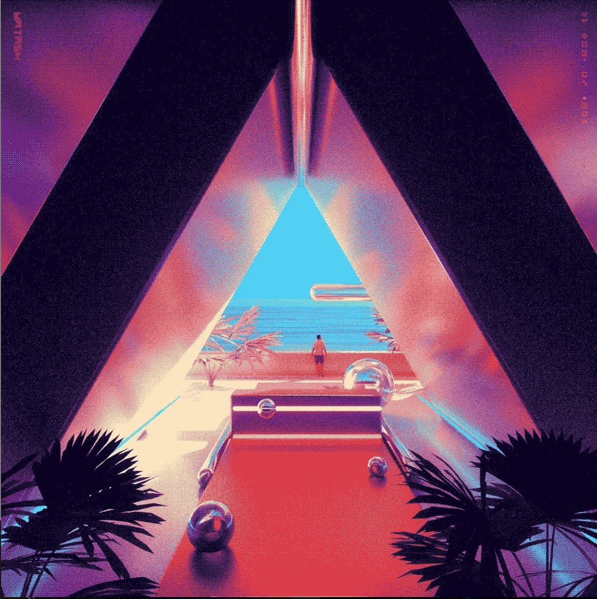
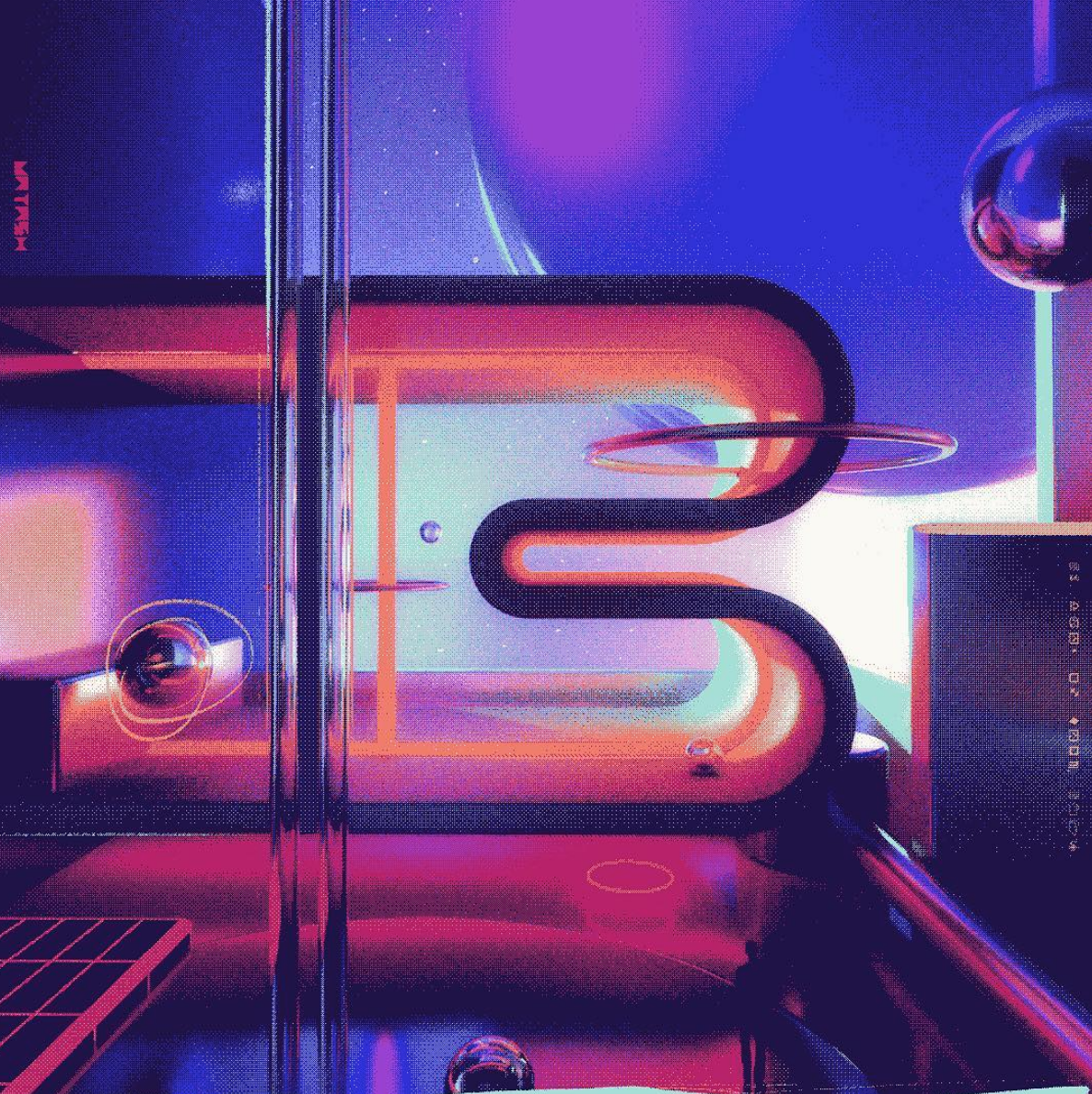
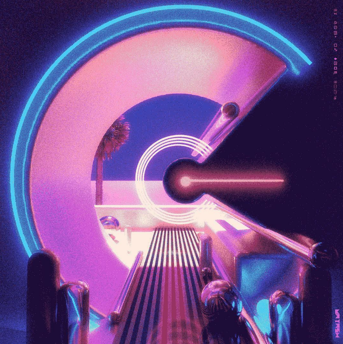
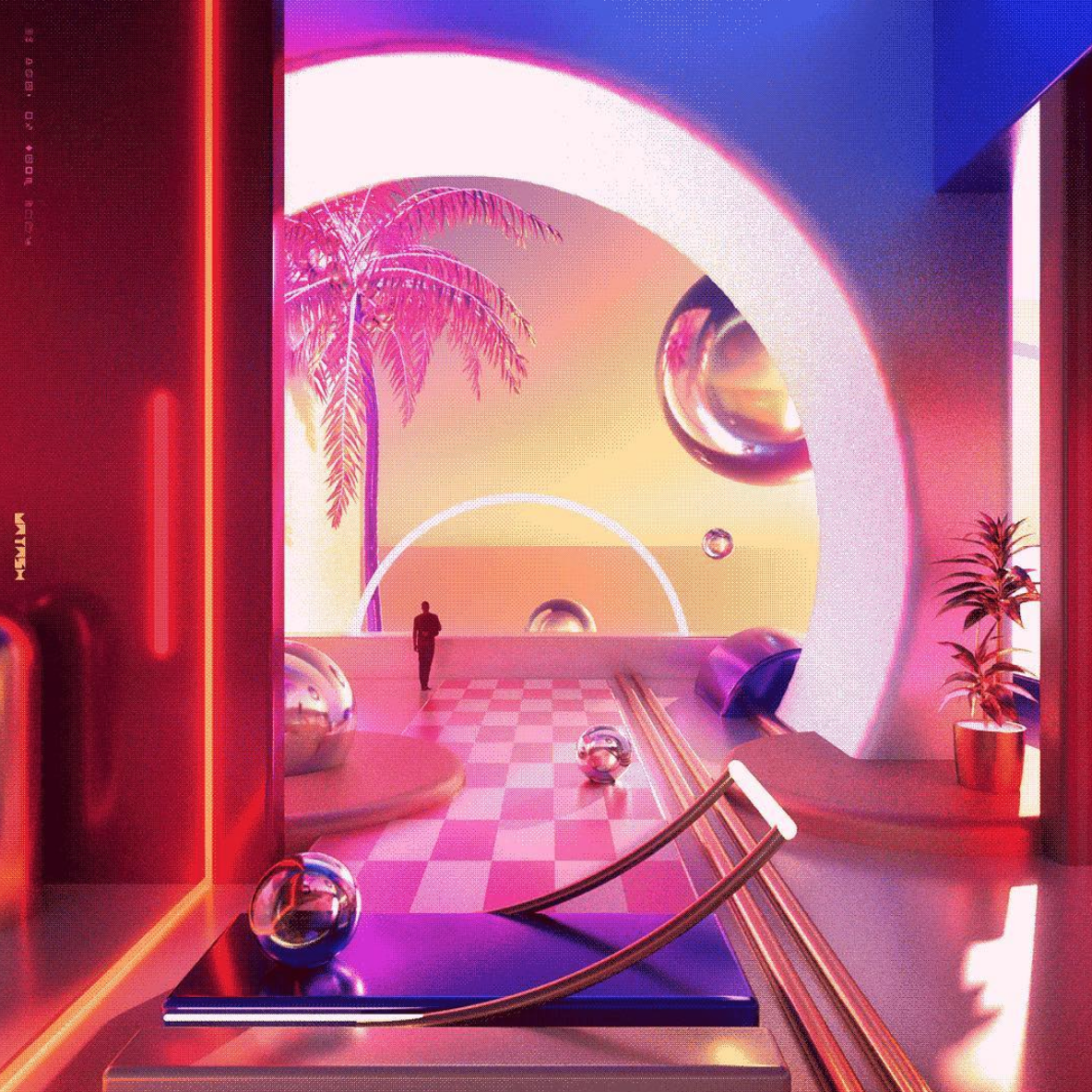
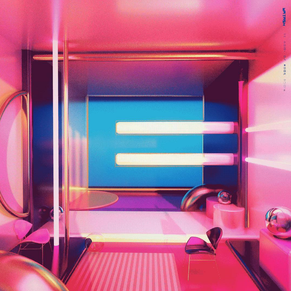
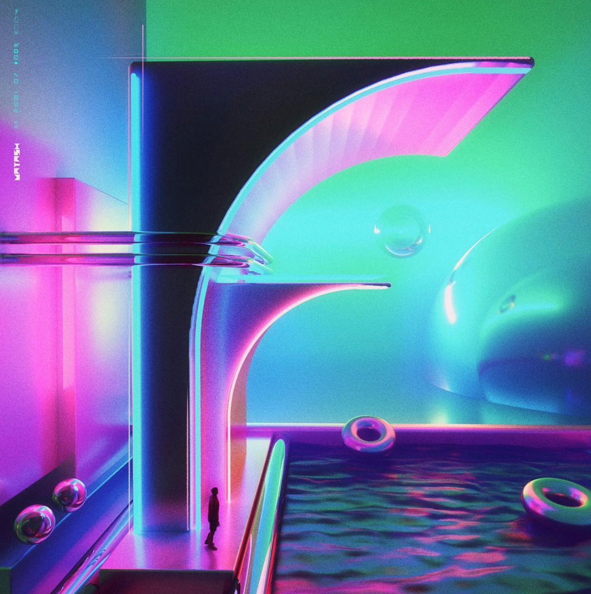
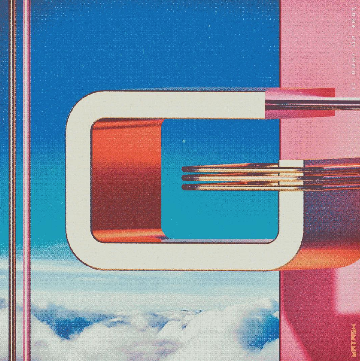
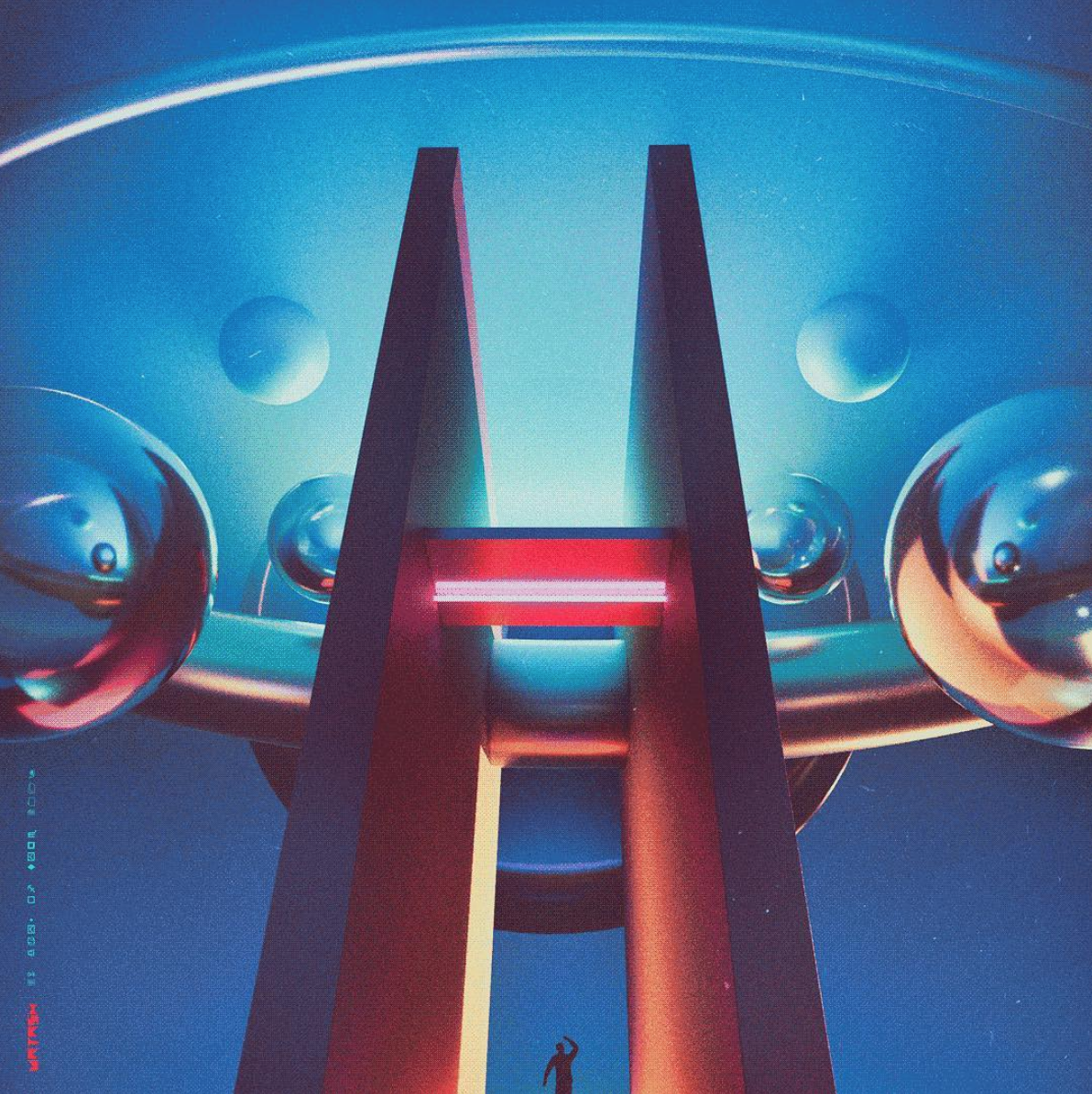
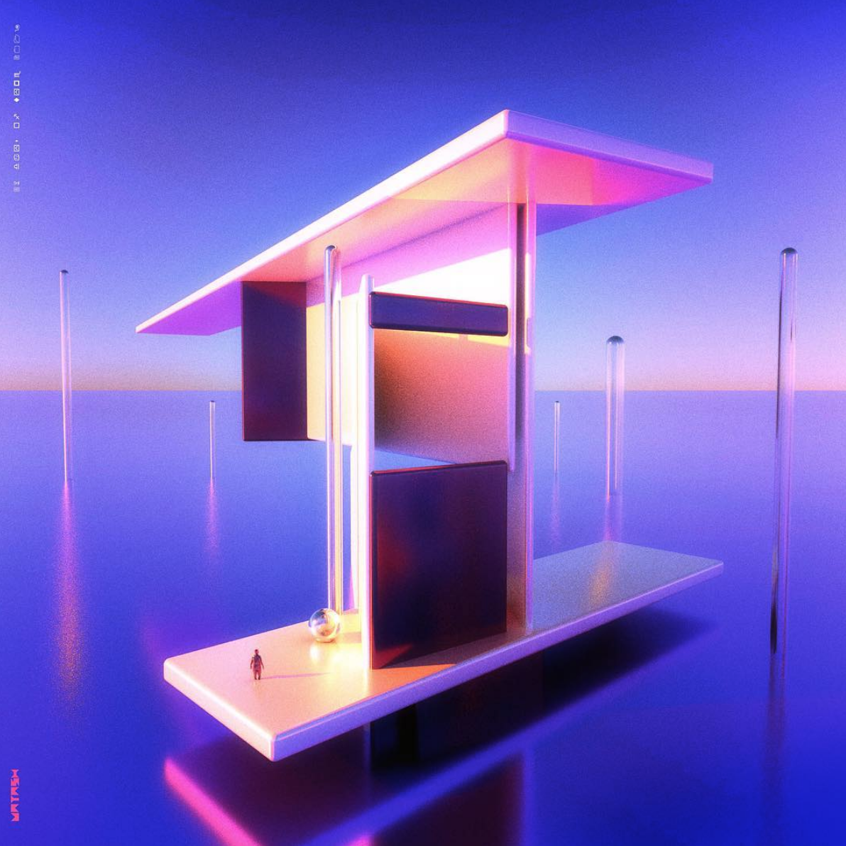
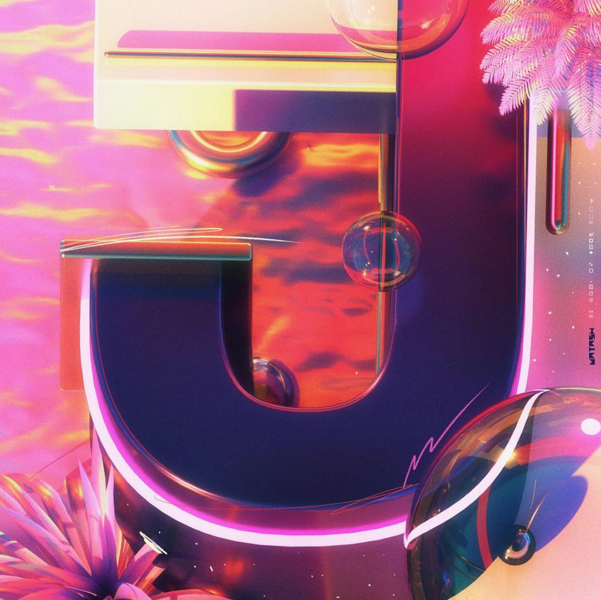
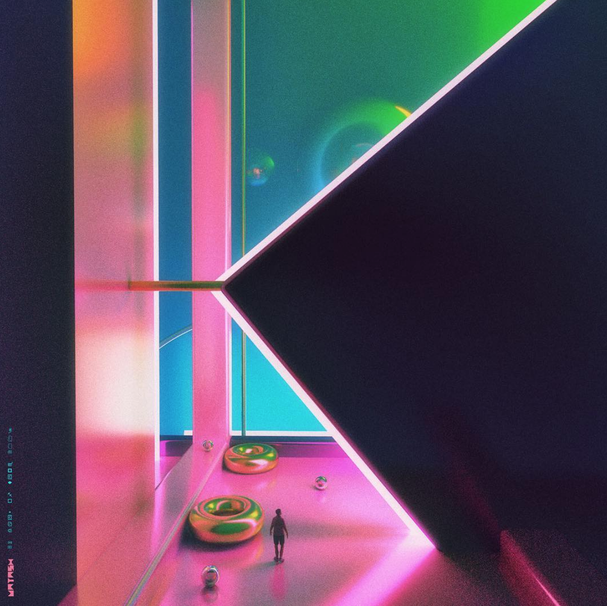
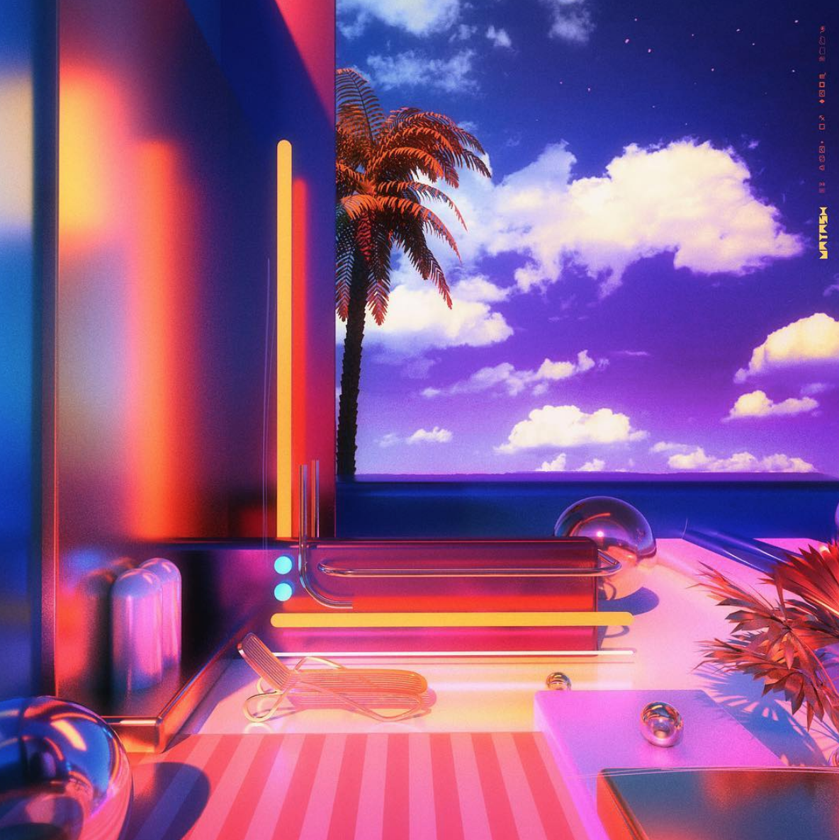
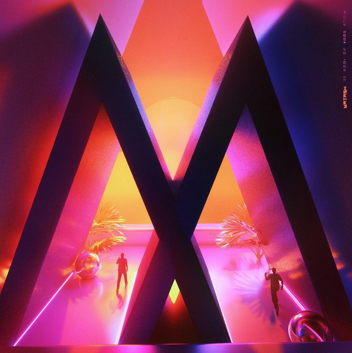
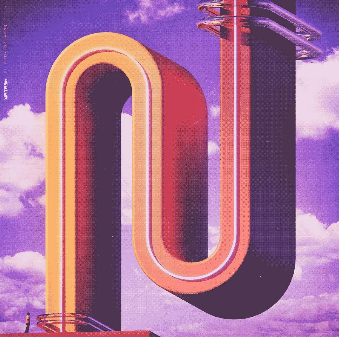
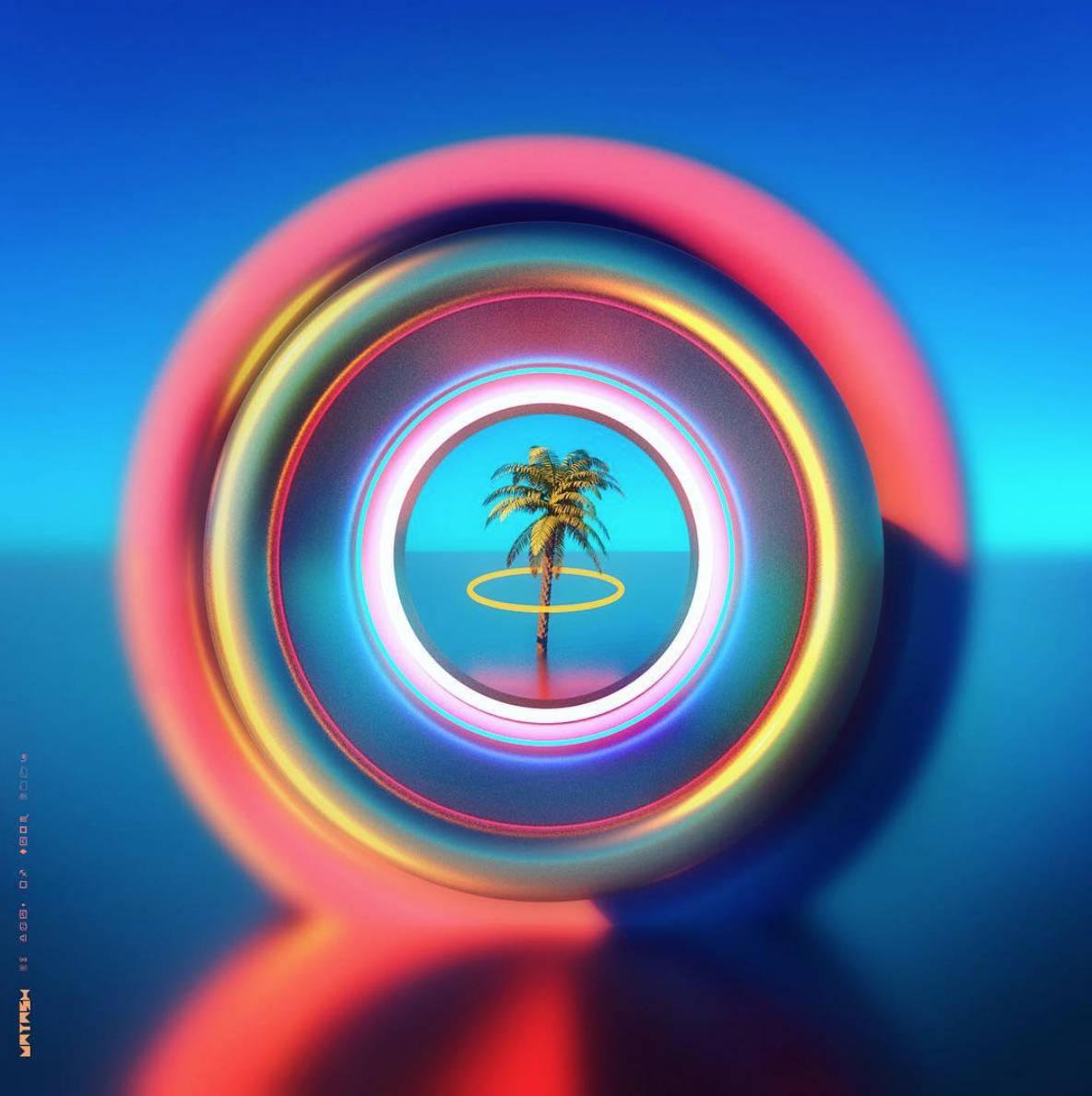
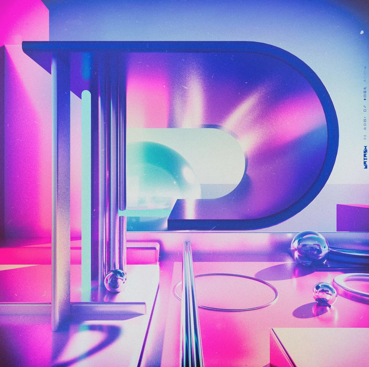
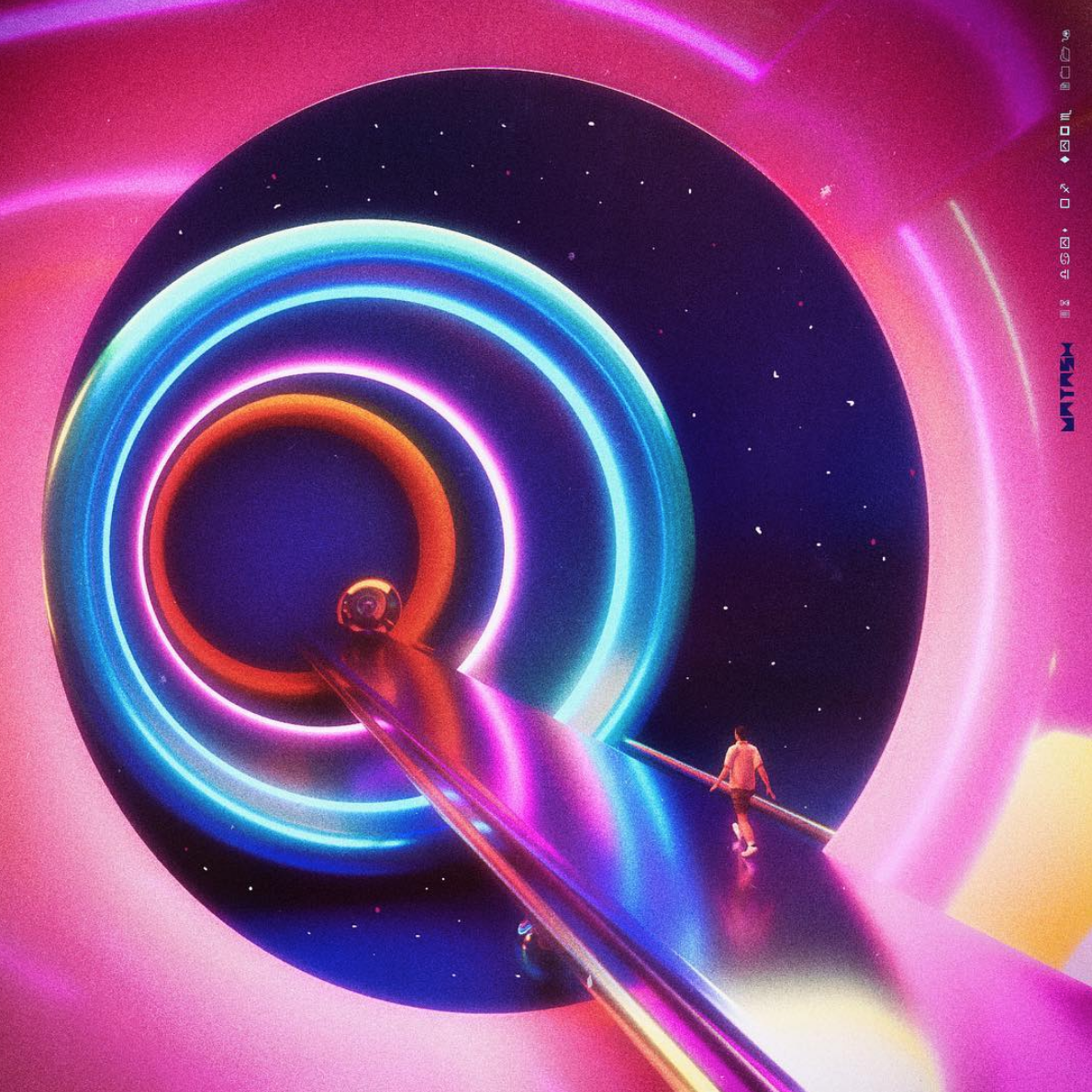
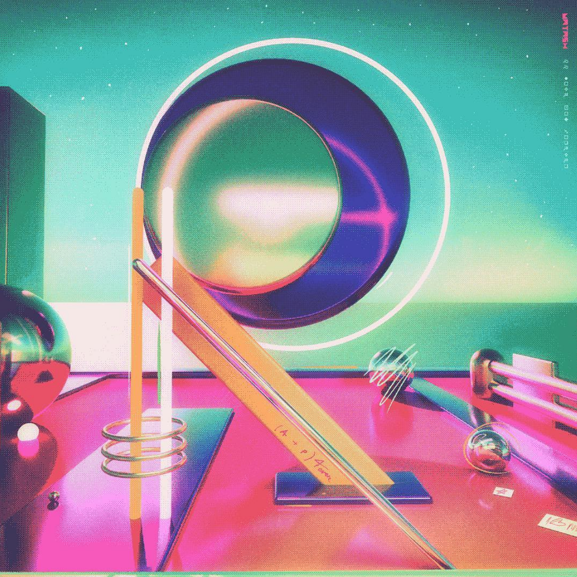
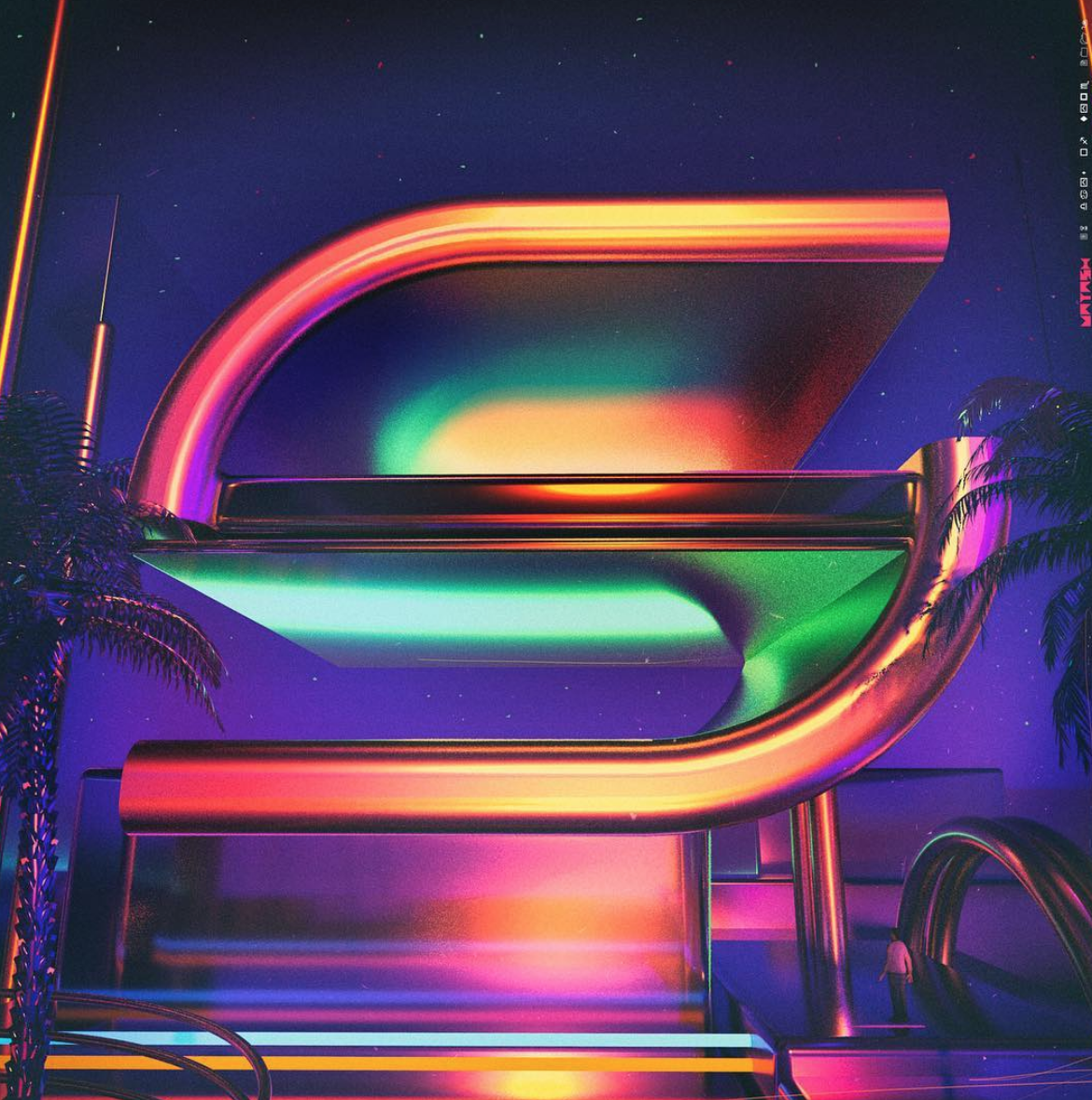
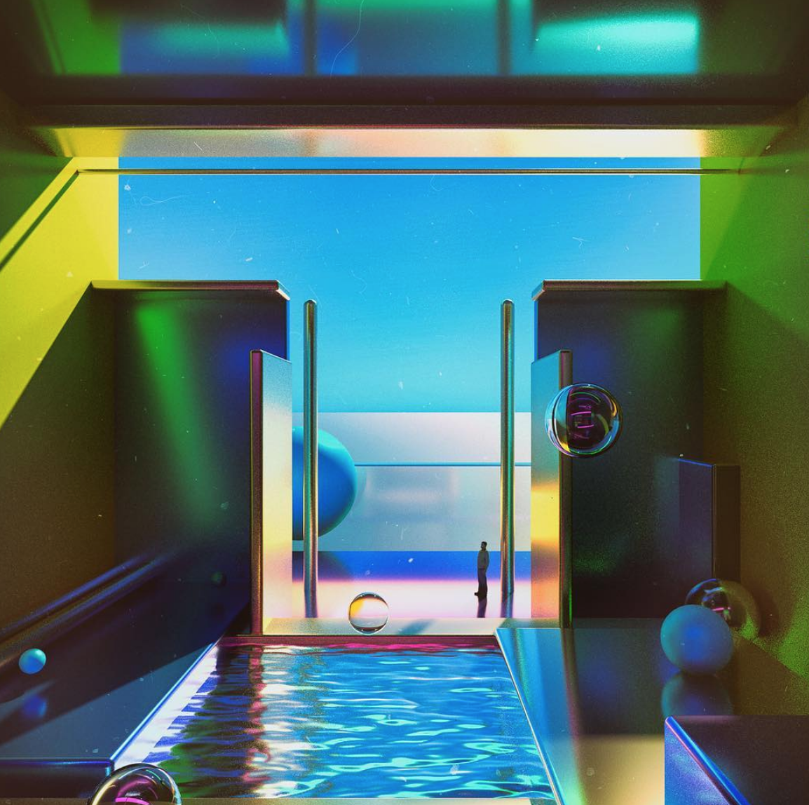
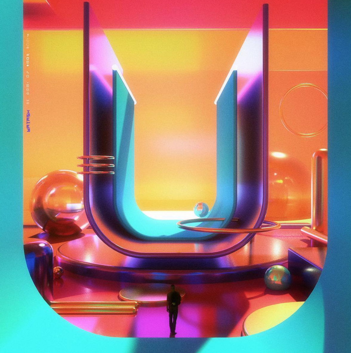
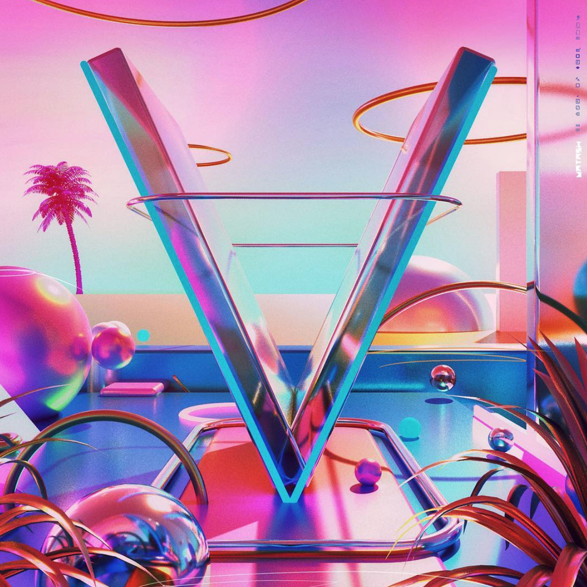
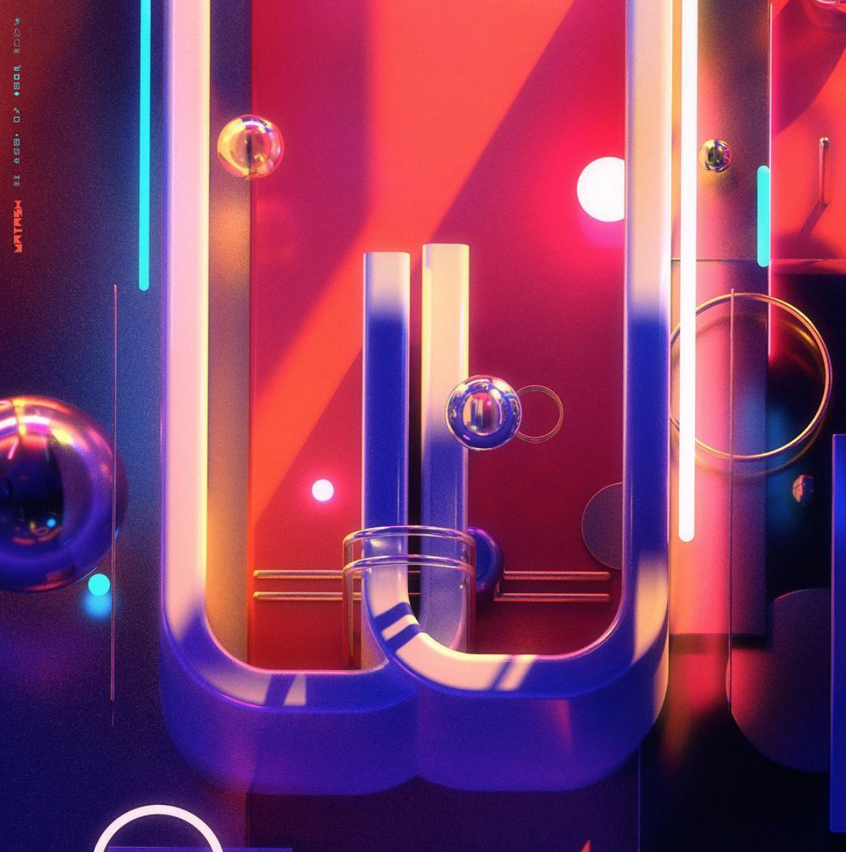
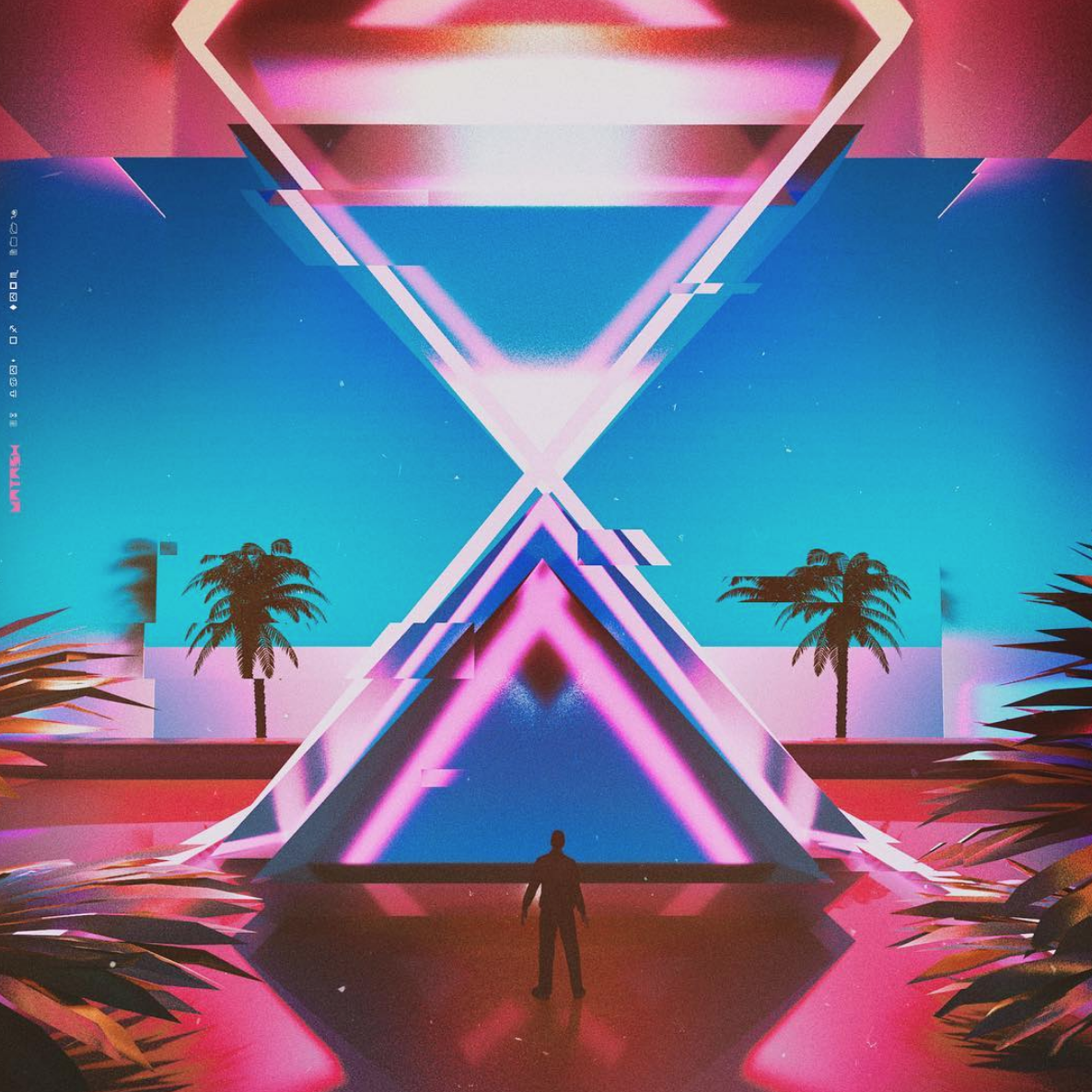
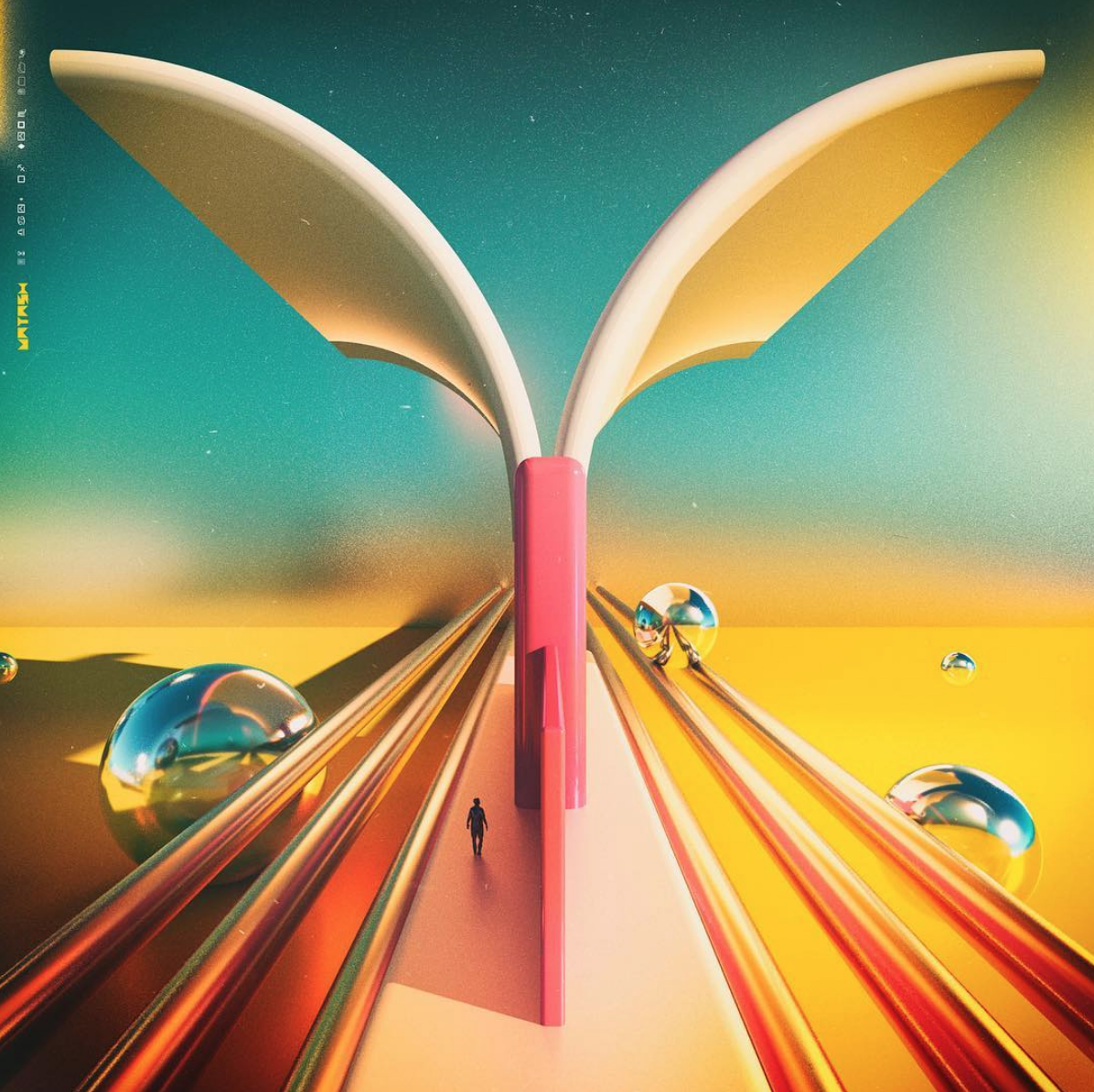
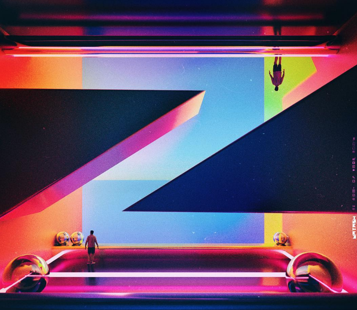
Pretty much every artwork starts out with a couple of rough sketches, which I then develop further digitally. The pencil sketch is a great framework to build upon, and I feel it's the best medium for generating ideas.
Doing personal projects allows me to explore and experiment without any restriction. A challenge like 36 Days of Type has always been very rewarding to do, because a lot of unexpected and exciting things come out of it, and it is a true test of pushing oneself creatively.
Advice for emerging artists - The most important thing would be to make the work that you really love, and be yourself! :)
@vatash
Catching up with Lyn Tran from Draw & Explore.
Q - Tell us a little about yourself.
I’m a second-generation migrant, currently living in the beautiful city of Melbourne. My name is Lyn, and I’m the heart and soul (and ink stained fingertips!) behind boutique design and hand-lettering studio, draw&explore. My partner and I have a gorgeous husky called Cooper and I love letters and letterpress.
Growing up, my parents found it difficult to accept that design could ever be a successful career path. They suffered through many hardships during the Vietnam War and thought that being a doctor or a lawyer would bring the good and stable life they wanted for their children. It was only upon my graduation, where I designed a journal detailing my parents’ escape from the Vietnam War and gave it to them, did they understand the impact of design. I really love Sagmiester’s philosophy “Can design touch someone’s heart?” I definitely believe it can.
Q - What got you into the type game?
My fascination with type and lettering started in Japan and quickly became infatuated with their incredible craftsmanship and passion for beautiful handmade items, which really resonated with me. I
loved Japan so much that I decided to move there, where, in a tiny mansion in the heart of Osaka, I studied paper making, craft, lettering and calligraphy, and dreamt of the day I could do this for a living. Throughout my stay in Japan, I recorded my journey through hand- lettering in my journal. Fast forward 5 years, and I have transformed this knowledge of hand lettering, signwriting and print techniques into an unmistakable design style. I love combining playful hand-lettering, typography, illustration, unique print techniques and materials to create fun lettering designs that are bursting with happiness.
Q - Can you name any childhood memories of designing something?
My earliest memory of designing artwork would be when I was a teenager and was really interested in graphic design. My father ran his own textile business and I was assigned to create his business card. At the time, I was pleased as punch with my design where it featured a cute iron and sewing stitches. I look back now and I cringe, but what was most important was that my dad had faith in me to design an important aspect with his business. From then onwards, I started to study further and improving my design skills. If it wasn’t for this project, I would not be where I am today. Thanks Dad!
Q - What has been one of your most enjoyable jobs and why? (Please send us some pics of this work.)
One of my favourite projects is with Kate and Sam at #littlejarofhappiness. My task was to design and handpaint a mural with the phrase “I must have flowers, always and always – Claude Monet”. I instantly had heart eyes when I heard flowers and lettering in the brief. It was an interesting process as I rarely use a projector for large scale murals. My assistant and I arrived at the site at 4am, with our hoodies on and quickly outlined the artwork. We could see flashes and sirens going off behind us. The policemen got out of the car to chat to us. Despite, the fact we had permission from our client to paint their wall, I couldn’t help but feel extremely nervous. Turns out, they wanted to chat about the design and when we were expecting to complete the mural as this is their usual patrol area. I felt this particular piece really engaged with the community, as each person that walked by engaged in nothing but smiles and positive vibes, curious with anticipation more than anything. The interaction was priceless and supremely encouraging. The most rewarding aspect is hearing from the community, how much the mural has brightened their neighbourhood. And seeing all the selfies being posted on social media is the cherry
on top!
Q - Can you give us a bit of a run down on your process, the programs you use and any interesting quirks in the way you work.
One of my favourite processes in design is the opportunity to constantly experiment with ideas, especially with different materials and mediums. I really love to get my hands dirty with ink and paint!
I tend to work with pencils, brush pens, signwriting brushes and I’m a little obsessed with texture and paper. I love the fact we are surrounded by such amazing talent; there are so many creative people that inspire me to try new things, everything from techniques to mediums to materials – I’m a sucker for anything hand made.
Over the years, my processes of thinking and designing have changed. When I was younger, I had an extremely methodical approach – every element had to be perfect from the get-go. Working in different environments has challenged my auto pilot thinking and helped me become a much better designer. I’ve learnt all the rules, and call me a rebel but I also think some rules are made to be broken! It was only when I started experimenting outside my comfort zone (and of course constant practice) that I learnt to trust my instincts and take more of an organic approach.
My world has changed since the iPad has been introduced and expedited my process. It’s godsend! I tend to use my iPad to sketch my rough layouts and skeleton of my lettering. Then slowly evolve to finalise my sketch. Once I’ve refined the letterforms and concept, I will digitalise the artwork using either Adobe Photoshop or Illustrator.
Q - Any tips for emerging illustrators?
Don’t be afraid to put yourself out there.
With social media, it’s a great way to connect with other designers, illustrators and the community.
Stand by your principles – even if it means passing up a job.
Julia Townsend jumps on the Chulo Train.
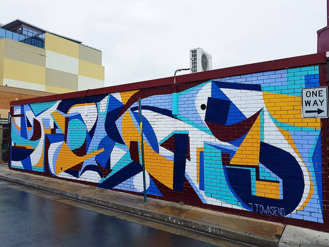
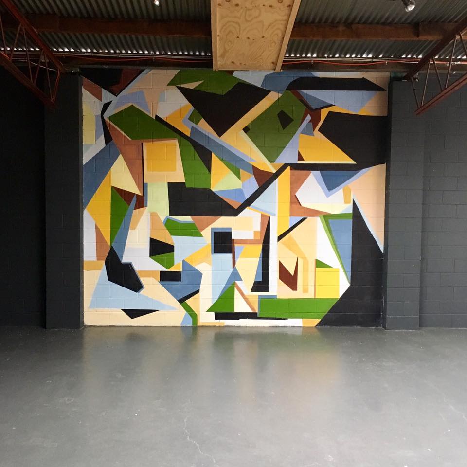
Julia is interested in abstraction as creating an open image that is beyond the boundaries of rational thought. She uses the presence of colour as the primary means of expression, alongside other pictorial elements. The field of abstraction grants Julia total risk, freedom and discipline that considers line, shape, colour and mass and how they interact with one another.
Some of our favourite Julie works are below.
New Creative coming through from Kristof!
We are really excited to be sharing Kristof’s work with you. His work is fresh, funny, super weird and we love it.
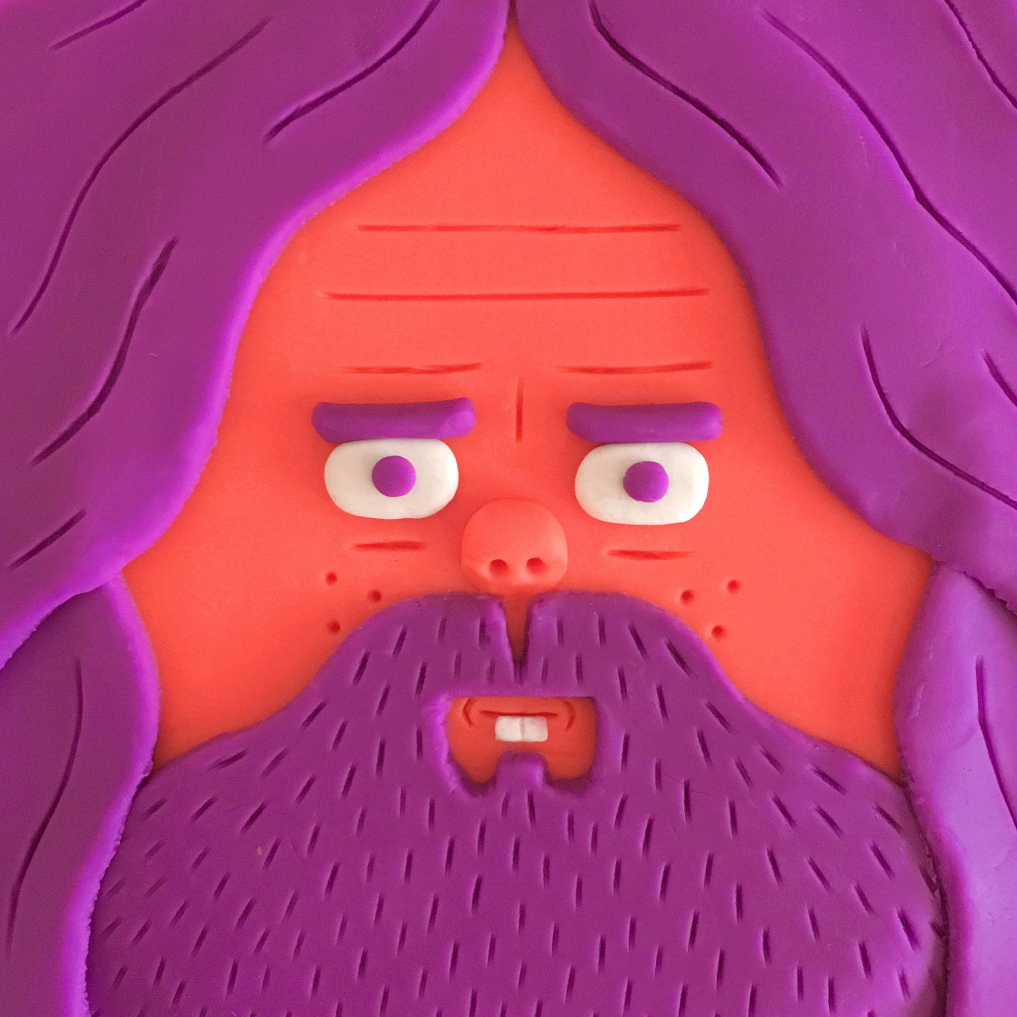
Kristof Luyckx is an artist based in Belgium, who specialises in character design. Kristof loves to create characters in any kind of form and for any kind of client or project: illustrations and animations for commercials, print ads, games, program titles, short films, clothes, toys, music videos, books,... Inspiration is often found in music, awkward situations, fauna and flora, facial hair, weird people and cartoons.
Check out more of his folio here.
Artist Shannon Crees paints a beautiful mural at Central Park in Sydney
Central Park Shopping Centre is one of Sydney’s most unique spots embracing Australia’s culture, arts and bringing back life and excitement to public spaces. Recently we had the pleasure of teaming them up with the colourful Shannon Crees to create this stunning mural. So Good!
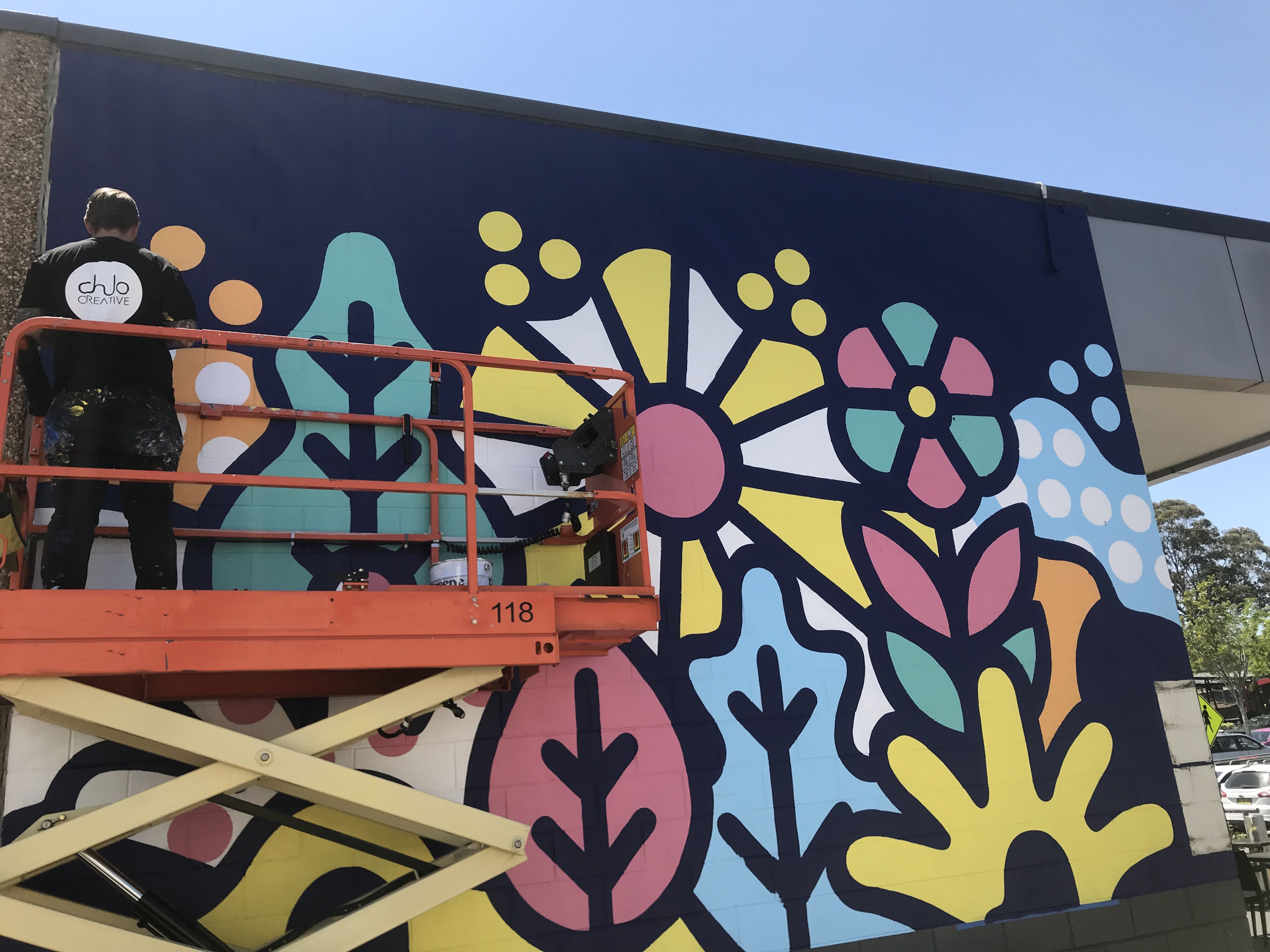
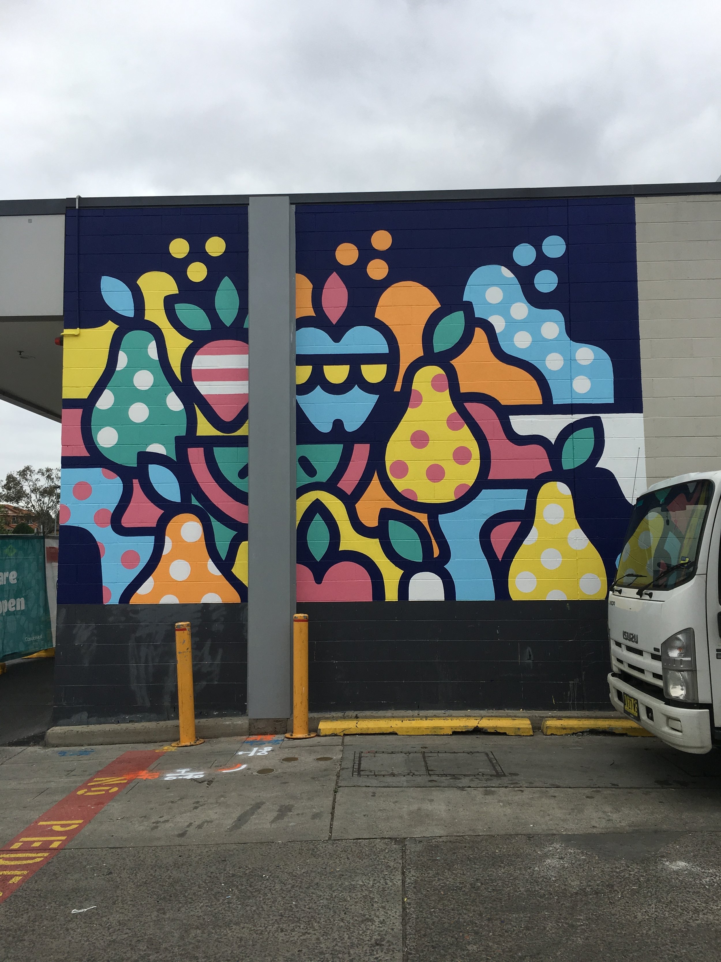
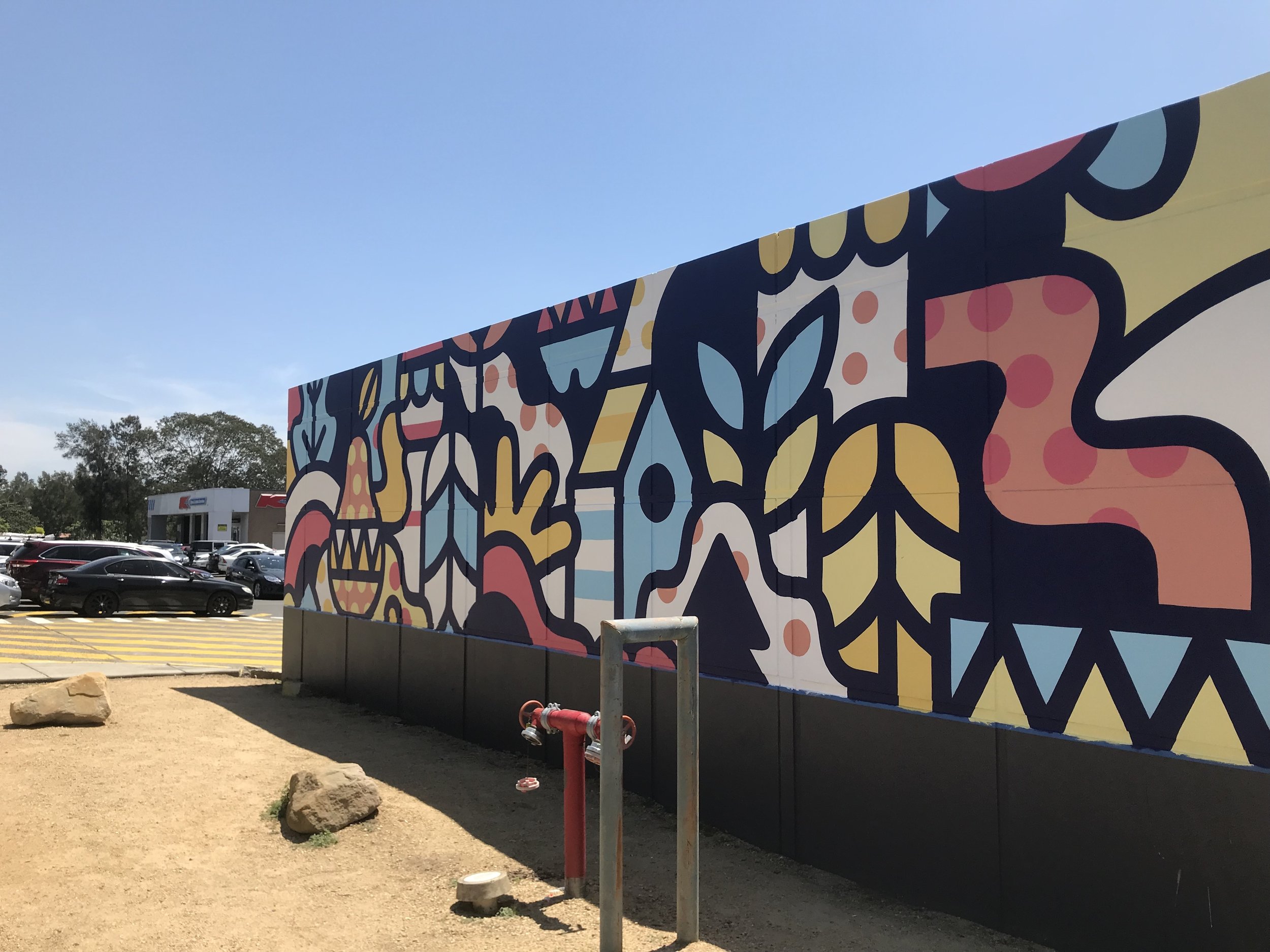
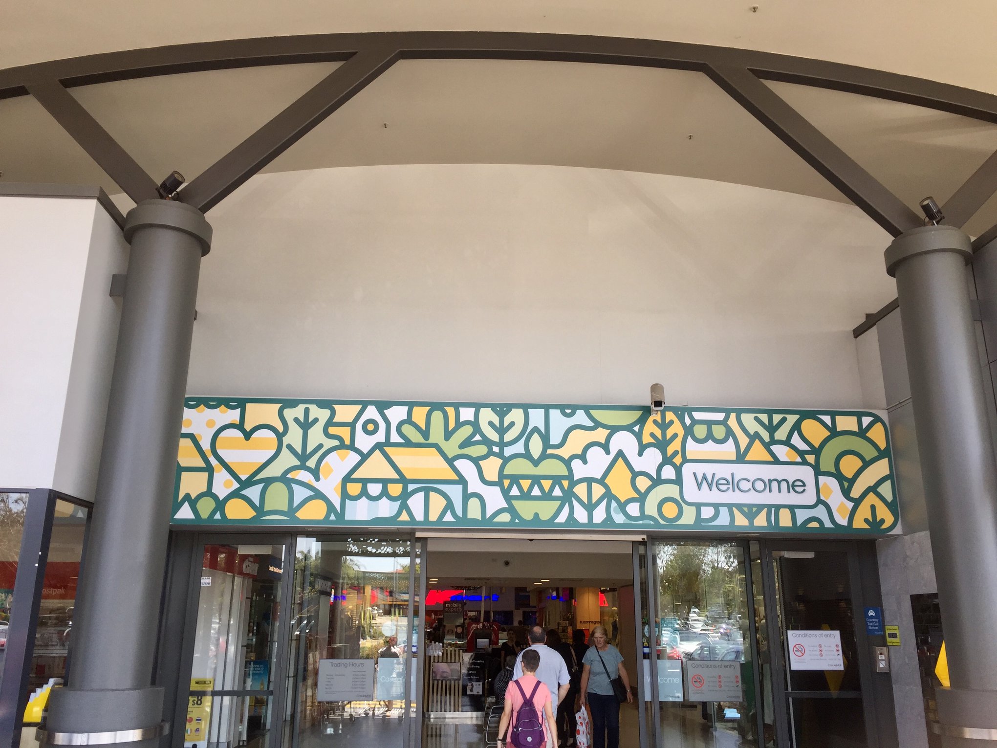
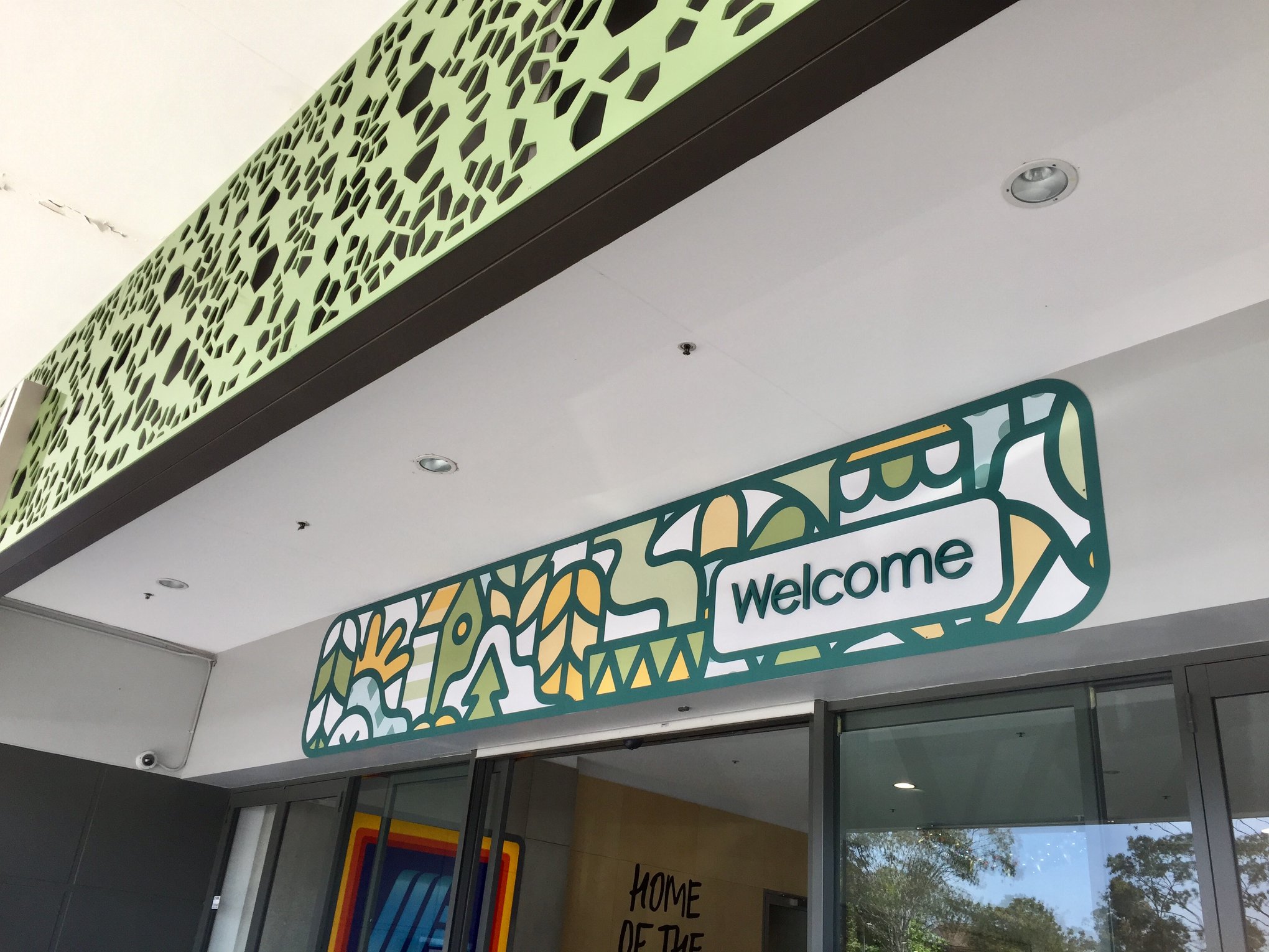
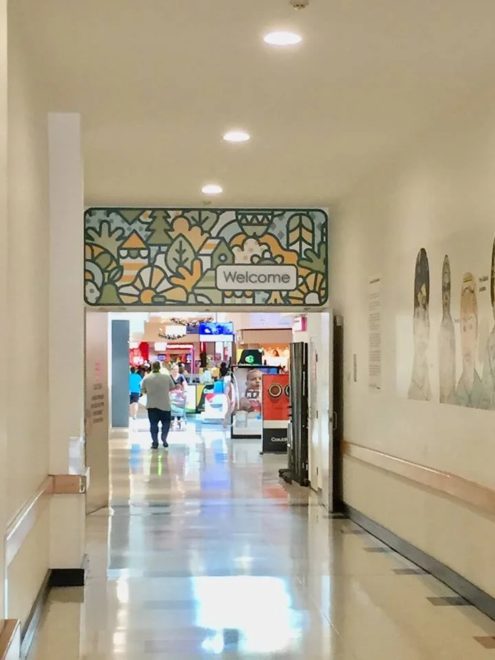
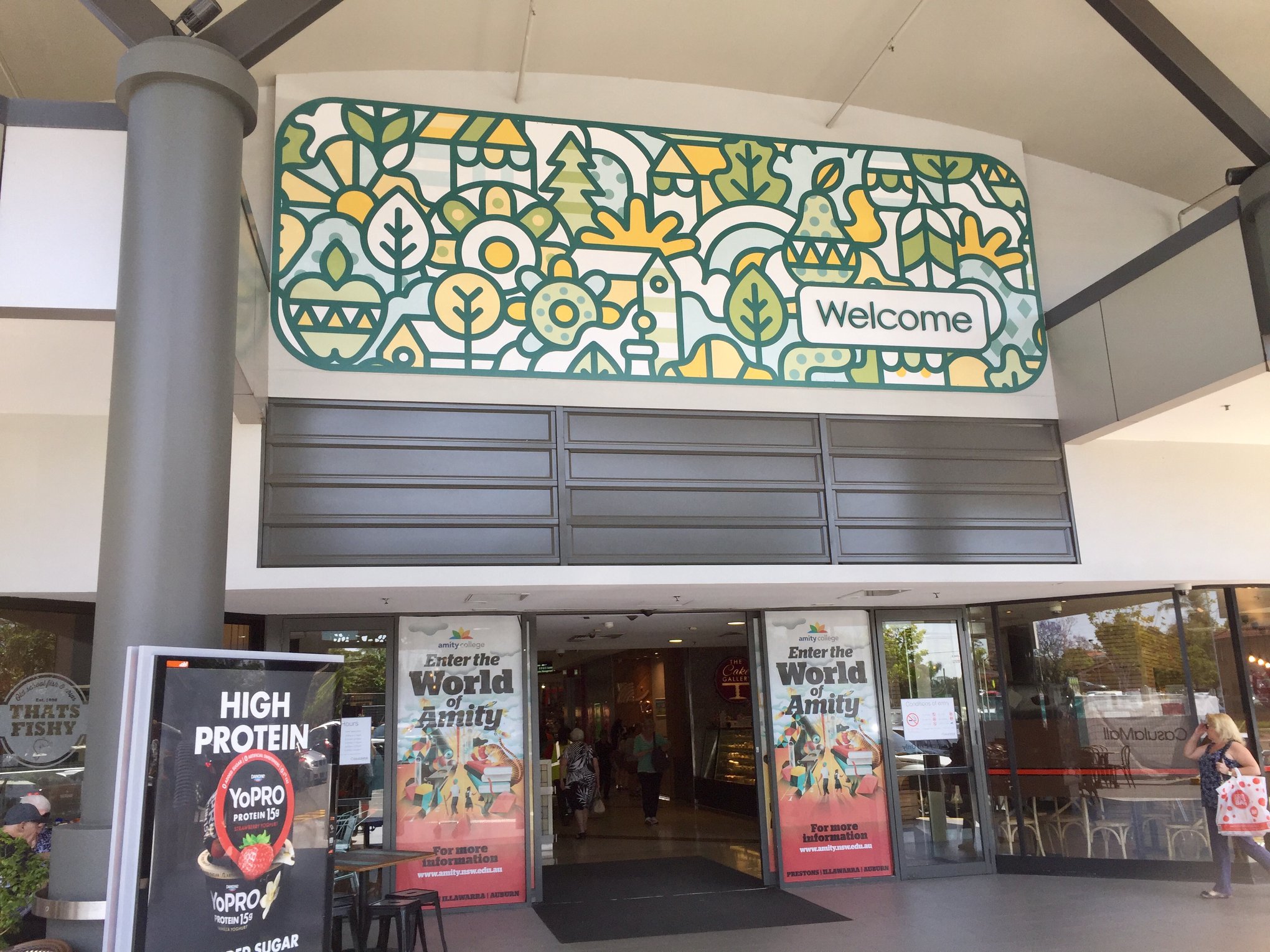
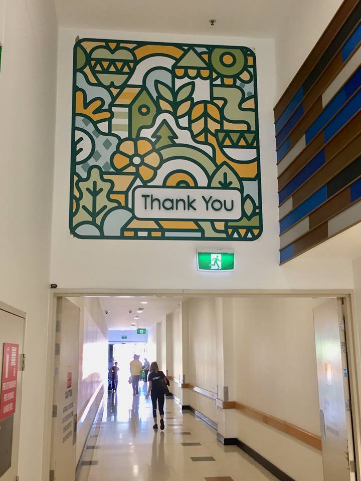
Casula Mall collaborates with artist Nico to create stunning rebrand.
Casula Mall approached Chulo Creative wanting to pay homage to the multicultural area of Casula and welcome the community into there space with artworks that celebrate the demographic.
The brief used kaleidoscope imagery as a metaphor for the meting pot of cultures in the area. We knew Nico would be the perfect artist for the job with his crafted style of bold popping colours.
“I have played with the idea of the “Kaleidoscope of cultures” phrase from their style guide and tried to make a really diverse tapestry-like pattern that feels a bit earthy.
Its very abstract, but the design has some shapes that are representative of eating and drinking, fruits and bottles etc. which are representative of the “sensual experiences” to be enjoyed together in abundance at the centre as well as plants and houses in different patterns that symbolise the diverse community made up of many different cultures, all growing and living together and together forming a vibrant, interesting and beautiful tapestry.
I have used their corporate colour palette, but just used some lighter tints of their colours, as the actual full strength colours would create a bit of a heavy and dark vibe. Ive opted for the outline in their main corporate colour as. I think it needs to feel on-brand and fresh, warm and welcoming.” - nico


James Lesjak Sprouts this beautiful mural
James Lesjak helps create a beautiful garden oasis with this new mural at the Bank Hotel in Newtown.
Daniel O'Toole Broken Colour
Newest body of work by Daniel O'Toole - Broken Colour
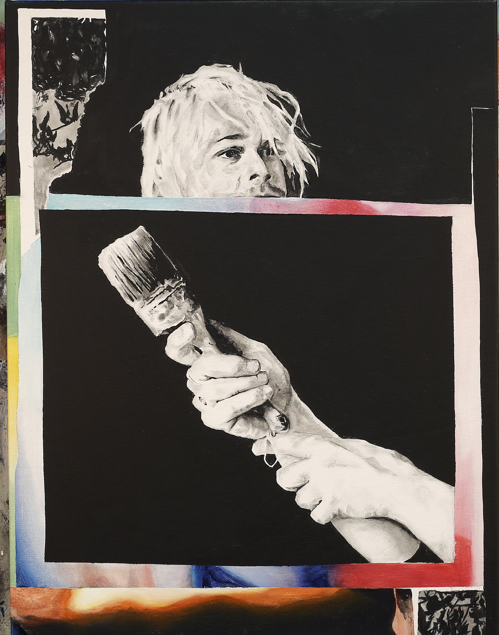
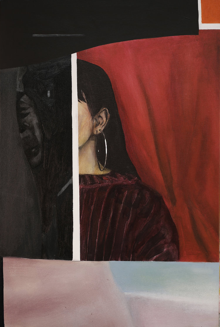
Broken Colour (2018) is a continuation of Bending Light (2017), a series of works made on location in Melbourne. These new paintings are based on a series of photographic collage studies that utilise a combination of physical distortion and analogue photographic techniques that blur the boundary between the materiality of painting and the surface of the photographic image.
Broken Colour takes things a little further into abstraction, employing collage as a means of discovery within the picture plane by playing with spacial tension, geometric editing and digital aesthetics. These images are resolved when returned to the analogue space of painted canvas.
Stay up to date with more work from Daniel here
ZEKE’S ARCANA - A TAROT DECK THAT IS UNIQUELY ZEKE.
Each major arcana card will have its own colourful, dynamic take on the classic Rider-Waite cards. Expect plenty of space age twists and sexy otherworldly women.
Magic this strong doesn’t come into the world overnight. It’s going to be a long journey. Don’t miss out on the process - keep an eye on Zeke’s Blog
THE SUN
The Sun is the manifestation of all things right in the world. Love, enjoyment, optimism and positivity. There’s no second guessing this – it signifies very good times and abundance. In fact some say the reversed card still represents exactly the same values – albeit in a minor form. The Sun lights the way for the child rider (your will) who is in perfect control of its stead (your baser self). In other words: F*ck Yeah!
THE STAR
The Star can be a welcome reprieve after a period of destruction and turmoil. When the non-essential parts of yourself have been stripped away, your core essence shines bright. The card represents youthfulness and hope. The card is also aligned with The Aquarius star sign. Big ideas are what will excite you and this time you're determined that nothing will get in your way.
THE HIGH PRIESTESS
The High Priestess is the guardian of the subconscious. Her appearance signals a lifting of the worldly veil - a transition into intuition and magic. Things aren’t always as they seem and there are often unknowable forces at work. Go inwards, be still, and listen to you deepest intuition. You’ll find answers. All in good time.
Gina Kiel for Sea Walls - Tairāwhiti
Gina Kiel talks about her epic mural for Sea Walls
“The wave forming in stages internally through the deconstructed parts of the Sea lion represents the sea as the emotion of nature that is currently trying to communicate to us the effects of our destructive actions. Sea lion population numbers have halved and could halve and halve again until extinction within the years of my generation. We have the opportunity to collectively rise with this tide into a new state of awareness where we can live in harmony with nature and all her beings.
After I had sketched up the Sea Lion I discovered a leaking water pipe unintentionally positioned in the heart/shoulder of the Seal, I felt like it was significant so I painted a blue heart around it. We are all made of water.” Gina Kiel
.
Special thanks to project partners Eastland Community Trust, JN Williams memorial trust, @gisbornedc, @resenecolour, Tairawhiti Environment Centre, Walter Findlay LTD, and to our sponsors
Martins Hiremaster, Hirepool Gisborne and Evolution Wireless.
Photos by
Portrait and in-camera double exposure by @emilyrafteryphotography
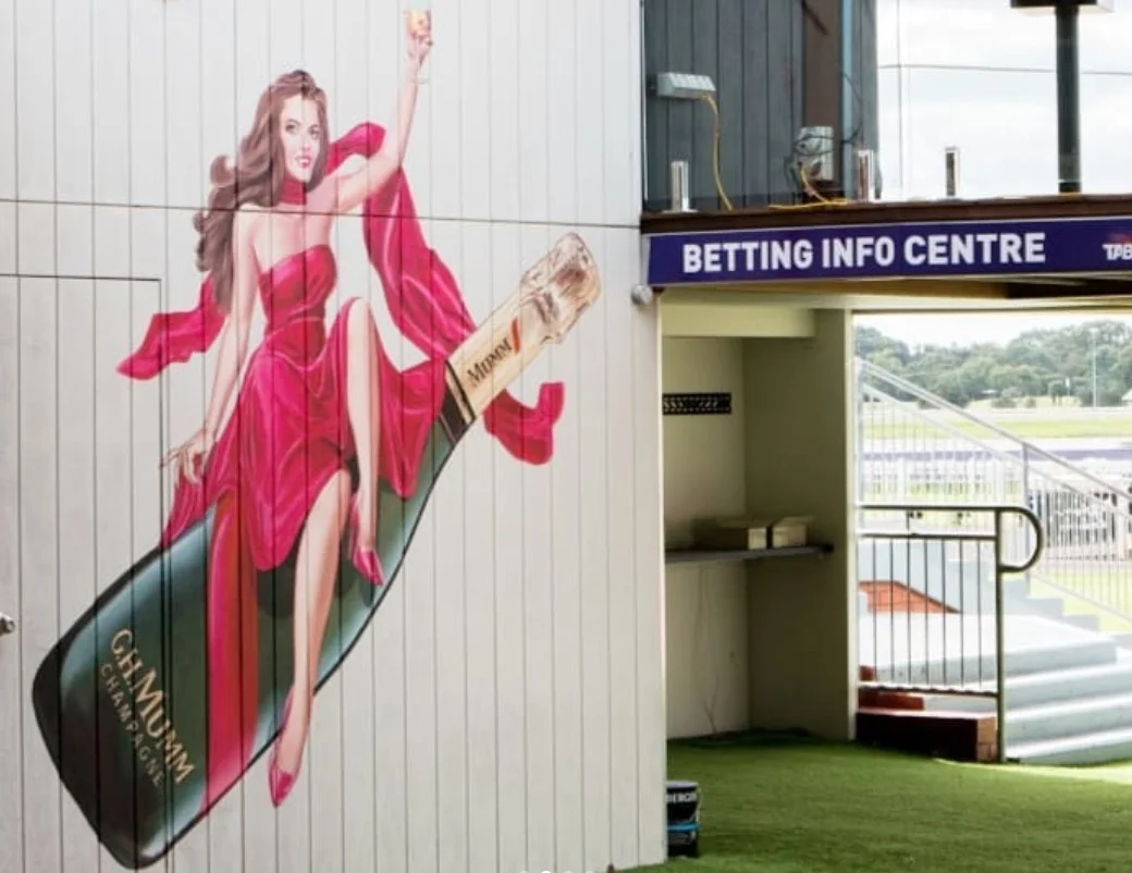
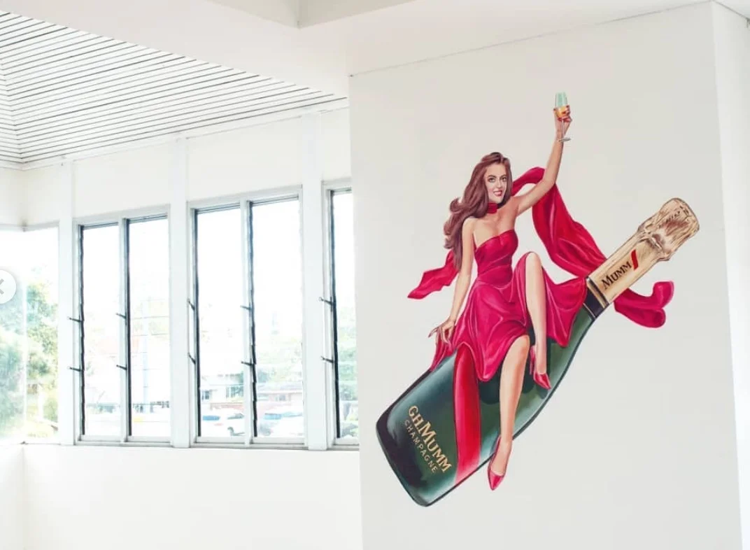
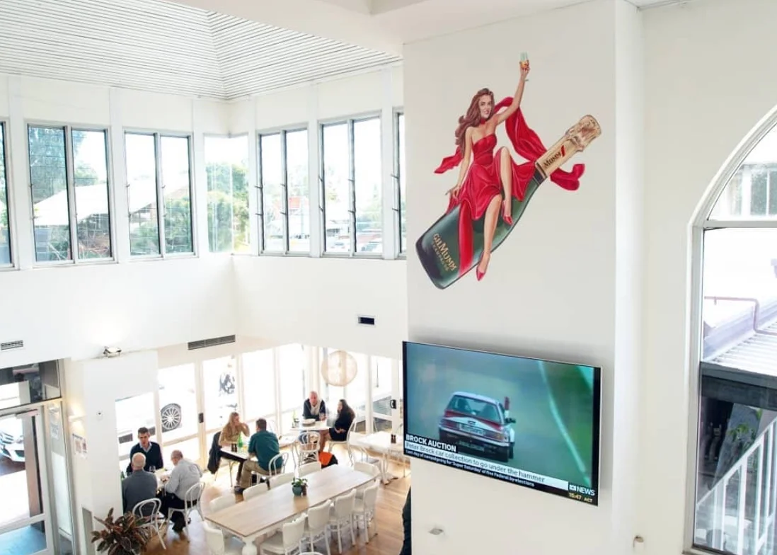
Crack that champaign on that wall!
The bubbles are flowing with this sparkling new murals
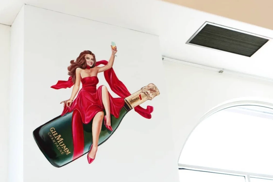
Pernod Richard approached us to revamp a beloved poster featuring the Mumm champagne.
We thought Gerad Taylor was just the guy to bring this to life.
With a classy twist, the poster was rendered in a modern day pin up style.
Pernod Ricard commissioned Apparition Media to paint the artwork in some treasure venues for that extra wow factor.
Sydney Verandah Bar Grows A New Look
TBT to when we smashed out another super cool mural with WA artist Chris Nixon at Verandah Bar in Sydney.
Referencing the local flora with naturally occurring patterns and textures. Nixon created a lush inner city oasis to integrate seamlessly with the great interior by Lucetti Krelle.
Crank Zappa zaps awareness on being plastic wise in this years Vivid Festival
Crank Zappa is the newest creation by the artists and our friends from amigo & amigo.
Read MoreTara Phillips Illustration getting a lucky treatment in Melbourne
We recently got lucky connecting Tara Phillips and legends from apparition media to create this amazing piece of street art in Melbourne as part of AAMI's new campaign spreading luck over the town.
Tara's realistic illustration of AAMI's iconic girl truely feels at home amongst the incredible street art that Melbourne is famous for.


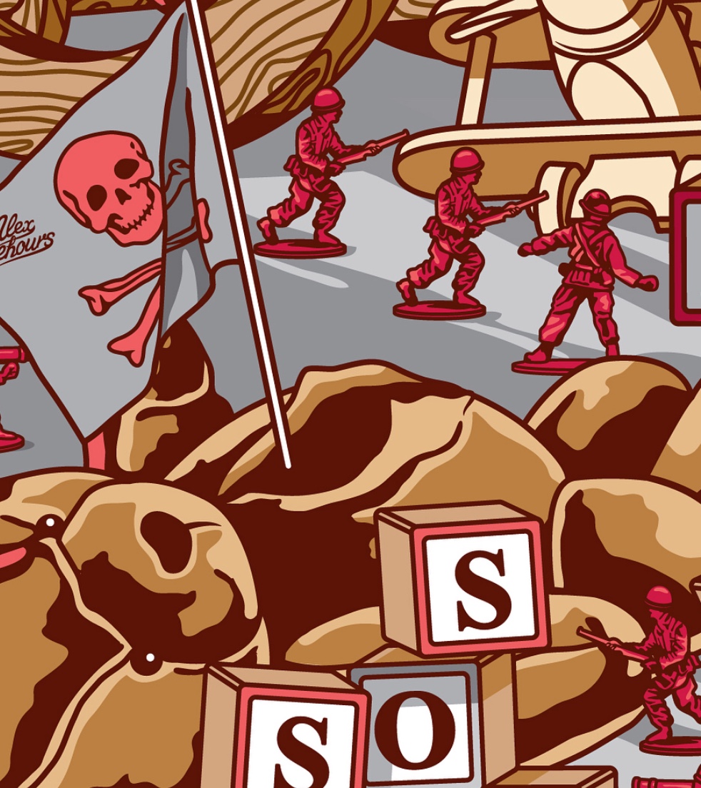
The Dicktator snowboard design with Alex Lehours
Nuclear threats is child's play.
Coming in hot and melting slopes with some nuclear action is Alex Lehours cracker of a design on this limited edition snowboard.
There is nothing more we love then a great creative brief allowing an artist to have fun with it.
Teaming up snowboard.com and Alex Lehours to create The Dicktator.
