
When Actually Partners came to us, they didn’t need a logo refresh for the Sydney Flower Market Rebrand. They needed something for the The Sydney Flower Markets stall holders to believe in.
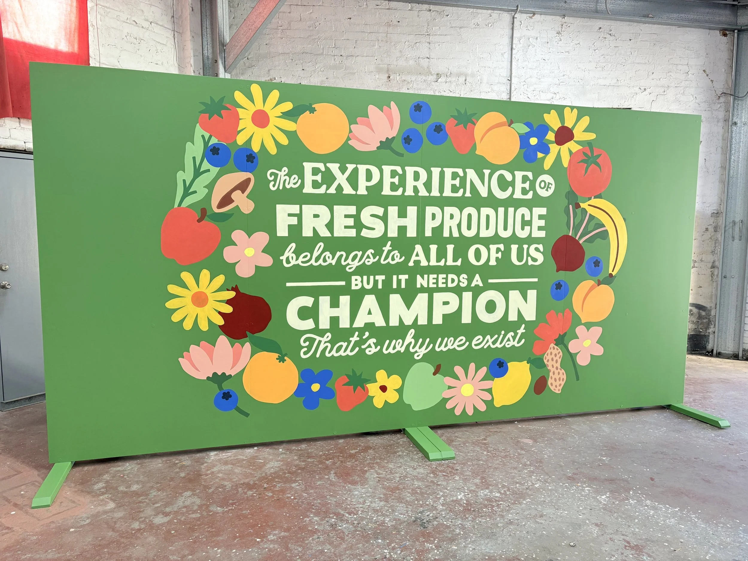
Over several months of workshops with the market’s community — growers, wholesalers, florists, stakeholders — one line rose to the top as the belief at the heart of their new brand: the experience of fresh produce belongs to all of us, but it needs a champion. That’s why we exist.
The brief was to bring that statement to life as a single artwork, and to make it the centrepiece of the market’s rebrand launch. It needed to hold the room at the event — where attendees would physically sign their names to it — and then move into permanent life inside the market itself.
Nico turned it around in record time: a hand-painted piece nearly the width of a shopfront, wrapped in a wreath of strawberries, blueberries, citrus, mushrooms, tomatoes, pomegranate and flowers in a punchy, flat-colour palette on deep green. The belief statement sits dead centre in mixed serif and script type — readable from across a warehouse, let alone a market floor.
Built for two lives; That’s really the trick of this piece — it’s not an event prop that gets retired, and it’s not a static mural that had to be shrunk to fit a truck. It’s doing both jobs from the same build. Freestanding for the launch, signature-ready in the negative space, then straight onto a permanent wall once the market’s done with it.
Artwork by Nico. Sydney Flower Market rebrand, 2026.